
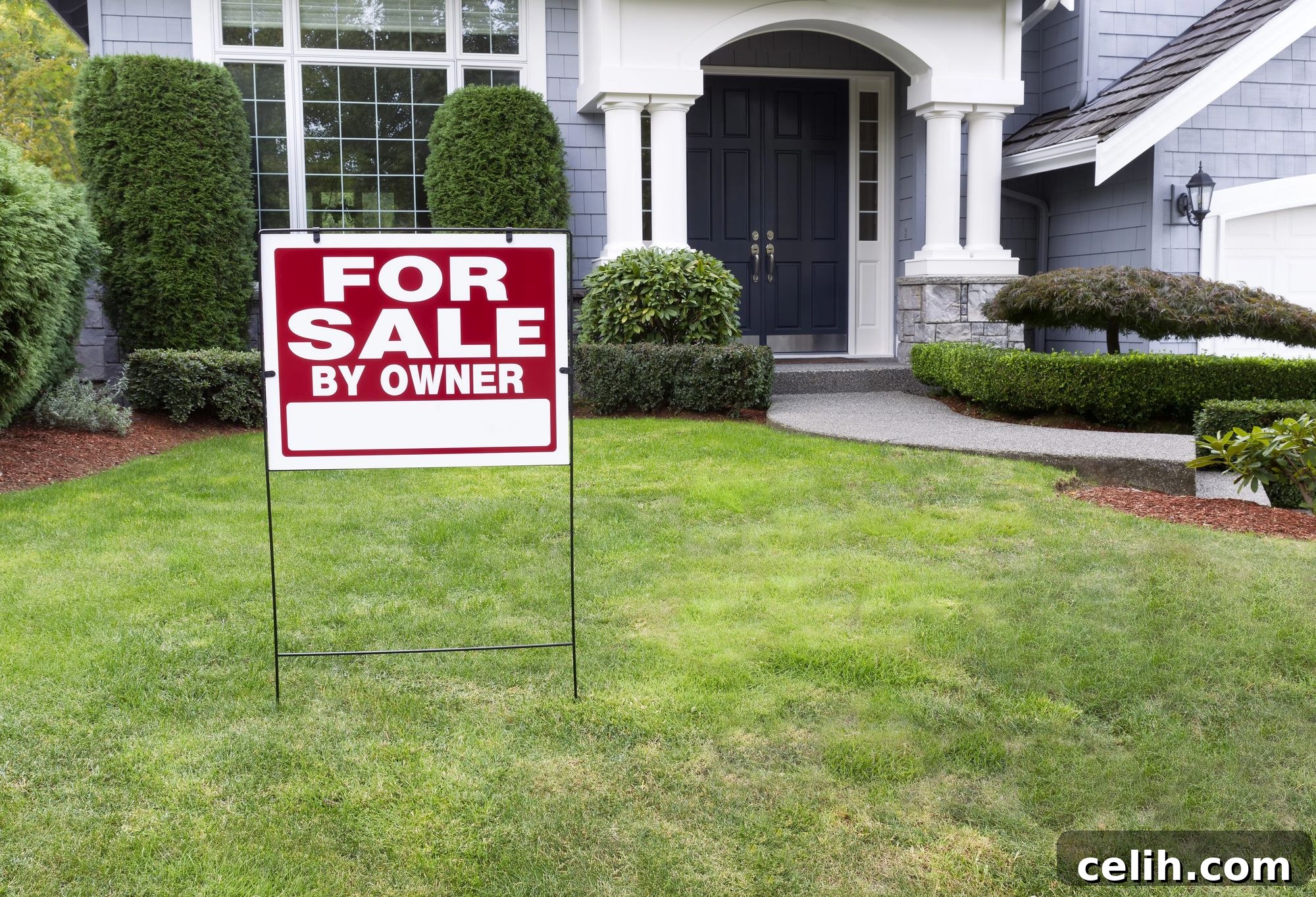
In the fast-paced world of outdoor advertising, your yard sign has mere seconds to capture attention and convey its message. At typical driving speeds, a potential customer sees your sign for a fleeting 3 to 5 seconds before it disappears from view. This narrow window of opportunity is all you have to communicate something memorable and actionable. An expertly crafted sign can be a powerful, 24/7 salesperson, generating leads and building brand recognition. Conversely, a poorly designed sign, no matter how brilliant its underlying offer, is a missed opportunity – a silent billboard that fails to connect because it simply isn’t readable or memorable.
Effective sign design isn’t about artistic whims; it’s rooted in the science of human perception. Our eyes are hardwired to process visual information in specific ways: scanning left to right, noticing stark contrast before subtle hues, and registering larger text before smaller details. These aren’t arbitrary guidelines but essential shortcuts to how our brains efficiently decode visual cues. Ignoring these fundamental principles doesn’t make your sign unique; it makes it invisible, rendering your investment worthless.
To ensure your yard signs transcend mere decoration and become powerful conversion tools, there are four proven design rules that consistently separate impactful signs from those that fade into the background. These aren’t just helpful suggestions or best practices; they are foundational, non-negotiable elements for creating yard signs that genuinely work to attract, inform, and convert.
Rule 1: Prioritize Legibility with Less Text and Larger Fonts
When it comes to outdoor signage, instant legibility triumphs over cleverness every single time. Drivers aren’t going to pull over, squint, or strain their eyes to decipher your message. If your sign’s core message can’t be grasped in a split second, it won’t be read at all. The goal is for your primary communication to be instantly digestible, typically requiring no more than five to seven words for the main headline, with any additional information serving purely as support for that central idea.
Font size is your most potent weapon in achieving this goal. A widely accepted guideline suggests that for signs positioned near roads where vehicles are in motion, letters should be at least six inches tall for every 100 feet of viewing distance. Generally, a minimum of six-inch tall letters is recommended for primary text to ensure readability from passing cars. The larger the text, the greater the distance from which your message can be clearly perceived. Resist the temptation to use tiny, decorative, or highly stylized fonts that might look appealing in print but become indecipherable from a distance. Simple, clear, sans-serif fonts like Arial, Helvetica, or Open Sans are consistently the most effective choices for outdoor signs, as their clean lines optimize readability at speed.
An effective visual hierarchy in your text ensures clarity: a dominant, large headline captures initial attention, followed by medium-sized secondary information, and finally, smaller yet still readable details such as phone numbers or website addresses. Every element should flow logically from your main point.
Crucially, embrace negative space – often referred to as “whitespace” – not as wasted area, but as essential breathing room. Cramming every available inch with text creates visual clutter, overwhelming the viewer and leading to mental fatigue. The human brain naturally gravitates towards simplicity and order. By strategically leaving ample space around your text and graphical elements, you allow your message to “pop,” significantly improve contrast, and convey an impression of thoughtful design rather than desperate information overload. This strategic use of negative space is what truly allows less text to translate into larger, more readable fonts, ensuring your message penetrates the visual noise and resonates with your audience from a distance.
Rule 2: Master Contrast for Unmistakable Visibility
High contrast between your text and its background is not merely a design preference; it is the fundamental difference between a yard sign that commands attention and one that simply merges into the surrounding environment. The most effective combinations leverage strong differences in light and dark: dark text on a light background (e.g., black on white, navy on yellow) or light text on a dark background (e.g., white on black, yellow on dark blue). What consistently fails are combinations where contrast is minimal, causing your message to fade or disappear altogether – think red text on a dark maroon background, or yellow text on a bright white background.
To verify optimal contrast, perform a simple yet effective test: step back from your sign and squint your eyes. If the words and key elements remain clearly discernible, you’ve achieved adequate contrast. If they blur or become indistinct, it’s a clear signal that your color choices need adjustment.
While color psychology plays a role in evoking specific emotions – blue for trust, red for urgency, yellow for attention – these psychological associations are utterly irrelevant if your message cannot first be seen and read. Prioritize immediate legibility over subtle emotional cues. Avoid technically clashing or trendy color combinations that might look good up close but create significant readability issues from 50 feet away. For instance, soft pink on white might be aesthetically pleasing in a brochure but is entirely ineffective on a roadside sign. Instead, commit to color pairings that offer undeniable contrast, allowing your core message to be clearly absorbed before concerning yourself with secondary psychological impacts.
Your established brand colors might lean towards subtle sophistication, but a yard sign is not the appropriate medium to showcase this nuance. Outdoor signs demand boldness and immediate impact. If your brand palette predominantly features pastels or low-saturation colors, your sign will likely require a darker or significantly brighter accent color to ensure maximum readability. This adaptation doesn’t mean abandoning your brand identity; it means intelligently translating it for a unique advertising medium. Your sign acts as an ambassador for your business, but its primary function is clear communication. Get people to notice and read it first, build familiarity with your name, and then reinforce brand association once your message has successfully landed.
Rule 3: Establish a Clear Information Hierarchy for Visual Flow
An effective yard sign meticulously guides the viewer’s eye through its content, presenting information in a logical and intuitive sequence. This is achieved through a deliberate information hierarchy. The typical and most effective hierarchy places your brand name or logo as the most prominent element, followed by your core message, and finally, your call to action or contact information. Your brand name should be the largest and most visually dominant feature, as it’s the primary element you want embedded in people’s minds. Your core message, while clear and compelling, should be slightly smaller, serving to explain what you offer or the purpose of the sign. Your call to action (e.g., phone number, website, “Open House”) should be easily readable but typically the smallest element, as viewers will seek this information once they understand who you are and what you’re promoting.
Visual flow is paramount; it ensures the eye moves naturally from one element to the next without confusion or wasted effort. For English-speaking audiences, the natural scanning pattern is typically left to right and top to bottom. Design your sign to leverage this innate pattern intentionally. Position your most impactful element (your brand) at the top or top-left, guide the viewer’s eye through your secondary message, and conclude with your call to action, often placed at the bottom. Strategic use of whitespace enhances this flow by creating distinct separation between elements, preventing them from competing for attention simultaneously. This ensures each piece of information receives adequate focus before the eye effortlessly transitions to the next.
While creative layouts are possible, consistent alignment fosters a sense of order and professionalism. Whether you opt for left-aligned, perfectly centered, or an asymmetrical design, ensure your choice is intentional and consistently applied throughout the sign. Random or haphazard placement creates visual chaos, which can subtly erode trust. A sign that appears sloppy or carelessly assembled might lead potential customers to infer that your business operates with a similar lack of attention to detail. Conversely, clean, deliberate alignment instantly signals professionalism, precision, and reliability, without necessitating an overly complex or intricate design.
Rule 4: Invest in Durable Materials and Finishes That Endure
The choice of materials and finishes is not merely an aesthetic decision; it’s a critical factor in your sign’s longevity, visibility, and ultimately, its ability to represent your brand effectively over time. Different finishes are suited to different environments. Gloss finishes, with their reflective qualities, make colors pop and catch the light, making them ideal for signs placed in shaded areas where they can leverage ambient light for extra visual punch. However, in direct sunlight, highly glossy surfaces can create glare and reflections that severely hinder readability. In such conditions, matte finishes are superior, as they absorb light, reduce glare, and ensure text remains clear and easy to read even under intense sun.
Durability is paramount because a faded, peeling, or damaged sign actively detracts from your brand image, signaling neglect or a lack of professionalism. Investing in UV-resistant materials is crucial for maintaining vibrant colors through months, if not years, of sun exposure, preventing premature fading. Similarly, weather-resistant inks are essential to prevent bleeding, smudging, and deterioration from rain, snow, and humidity. While cheap materials may offer initial cost savings, your sign will quickly appear weathered, worn, and abandoned, usually within a few months. This deterioration is noticeable to potential customers and communicates the exact opposite of what you intend. Your sign is constantly telling a story about your business, regardless of whether you consciously intend for it to do so.
Selecting the right material for your specific needs is key. Corrugated plastic, commonly known as Coroplast, is a lightweight, cost-effective, and versatile option that handles most weather conditions well, making it ideal for short-term campaigns like open houses, political elections, or temporary promotions. For more permanent installations requiring years of service, materials like aluminum, PVC (Expanded Polyvinyl Chloride), or MDO (Medium Density Overlay) offer superior durability and structural integrity. The initial investment in higher-quality materials pays dividends over time, as your sign maintains its readability, professional appearance, and effectiveness throughout its extended lifespan. You’re not merely printing a one-off item; you’re creating a long-term asset that continually works to promote your business and reinforce your brand reputation.
Conclusion: Master These Fundamentals for Maximum Impact
The four rules of effective yard sign design are not complex, but their adherence is absolutely non-negotiable for maximizing your sign’s impact. Prioritizing less text with larger, legible fonts, ensuring exceptional contrast, establishing a clear information hierarchy, and investing in durable, weather-resistant materials are the pillars upon which truly effective signs are built. Neglect any one of these fundamental principles, and the effectiveness of your sign will diminish significantly, regardless of how compelling your underlying offer or service might be.
Every single design choice, from the specific font you select to the durability of your chosen materials, communicates a message about your brand. These rules exist not because designers are hoarding secret knowledge, but because they are empirically proven principles of visual communication and human perception. By conscientiously applying them, your yard sign will not only perform its intended function but will excel, becoming a powerful, silent ambassador for your business.
Ultimately, these design rules are the crucial differentiator between a sign that receives a fleeting glance and is instantly forgotten, and one that successfully builds familiarity, conveys professionalism, and actively drives customer action. Stop perceiving these fundamentals as creative limitations; instead, embrace them as strategic tools to elevate your outdoor advertising and transform your yard signs into invaluable assets for your business.