
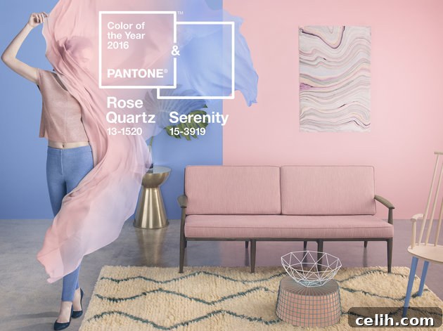
The world of interior design is constantly evolving, driven by an array of influences from fashion runways to global cultural shifts. At the heart of these trends often lies the authoritative pronouncements of colour giants like Pantone. Their annual “Colour of the Year” announcement sets a significant tone for design, impacting everything from home decor to graphic design and fashion. Back in December 2015, Pantone made a groundbreaking decision by naming not one, but two colours for 2016: Rose Quartz (a delicate pink) and Serenity (a tranquil blue). This selection immediately sparked curiosity and challenged conventional wisdom, especially in interior design, where the pairing of pastel pink and blue wasn’t typically an automatic choice for sophisticated schemes.
Historically, the combination of pink and blue might have evoked images of nurseries or overly saccharine aesthetics. However, Pantone’s specific shades offered a new perspective, suggesting a more refined and contemporary approach. Rose Quartz, with its soft, warm embrace, and Serenity, with its cool, calming presence, promised a harmonious balance. To explore the practical application and true potential of this unique duo, I embarked on a creative collaboration with Wayfair, a leading online retailer known for its extensive range of home furnishings. The aim was to demonstrate how seamlessly these compelling shades could be woven into everyday living spaces, transforming rooms with their gentle yet impactful presence.
Unveiling the Nuances: Rose Quartz and Serenity
The beauty of Pantone’s Rose Quartz lies in its gentle warmth. It’s not a vibrant, bubblegum pink, but rather a soft, dusty hue that exudes a sense of compassion and composure. It speaks to a desire for reassurance and comfort, providing a tender touch that can soothe the senses. This particular shade evokes feelings of tenderness, warmth, and a subtle charm, making it incredibly versatile for creating inviting environments. It aligns beautifully with themes of wellness and mindfulness, bringing a nurturing softness to any room.
Complementing this, Serenity blue is a captivating shade that transcends a simple light blue. It carries a distinct coolness, infused with an almost ethereal hint of purple, giving it depth and sophistication. Serenity is about lightness and airiness, offering a sense of respite and relaxation. It conjures images of the vast, expansive sky, symbolizing a mental escape from the daily grind and a desire for tranquility. Together, these two colours form a compelling narrative, as Pantone articulately describes:
This deliberate pairing speaks volumes about the mood Pantone aimed to capture. In an increasingly stressful and chaotic world, the choice of Rose Quartz and Serenity reflects a collective longing for peace, calm, and a sense of balance. They offer a gentle antidote to the harsh realities, inviting serenity and mental well-being into our homes. For me, the blending of these specific pink and blue tones immediately brought to mind the breathtaking spectacle of a sunset. Imagine the horizon where the sun dips below, painting the sky with a gradient of soft pinks melting into serene blues and subtle lavenders – a truly harmonious and natural display of these very hues. This natural inspiration solidified my conviction that these colours, far from being juvenile, possessed an inherent elegance and timeless appeal.
I recalled two cherished postcards that perfectly encapsulated this vision: one capturing surfers silhouetted against a vibrant sunset, and another showcasing a piece of appliqued hand-dyed silk, where these very colours blended seamlessly. These personal inspirations were a testament to the fact that Rose Quartz and Serenity were not just abstract concepts but colours deeply embedded in natural beauty and artistic expression, making them ideal candidates for a thoughtful interior scheme.
The Power of Color in Interior Design: Beyond Trends
Color is arguably the most powerful tool in an interior designer’s arsenal. It can transform a room, influence mood, and dictate the perceived size and temperature of a space. A well-chosen color palette does more than just look aesthetically pleasing; it creates an atmosphere, tells a story, and resonates with the inhabitants on an emotional level. The decision to incorporate specific colors like Rose Quartz and Serenity goes beyond simply following a trend; it’s about leveraging their inherent psychological properties to create a desired living experience.
Pastel shades, in particular, possess unique qualities. Their muted intensity reflects light gently, often making rooms feel more spacious and airy. They are less visually demanding than bold, saturated colors, contributing to a sense of calm and openness. For a bedroom, this is especially crucial. A restful environment is paramount for quality sleep and relaxation, and the soft tones of Rose Quartz and Serenity are perfectly aligned with this goal. They don’t overstimulate the senses but instead provide a gentle visual landscape that encourages winding down and rejuvenation. Pantone’s choice to combine them further reinforces this idea of balance and harmony, where the warmth of pink and the coolness of blue create a perfectly tempered sanctuary.
Styling a Bedroom Sanctuary with Pantone’s Duo
Undertaking the challenge of styling a bedroom with Rose Quartz and Serenity was an exciting prospect, especially given my initial reservations about pairing pink and blue. The bedroom, being a personal retreat, offers a unique canvas to experiment with colour psychology. The combination of the traditionally “feminine” pink and “masculine” blue seemed an intriguing way to create a universally appealing space that was both inviting and sophisticated, moving beyond gendered colour associations to embrace a truly harmonious aesthetic.
My exploration began with Wayfair, whose vast online catalog is a treasure trove for home decor enthusiasts. The platform’s extensive selection meant a delightful, albeit long, deep dive into countless options. After considerable thought and careful curation, I selected a range of products that would bring the vision to life. The key was to find items that not only featured the colours but also offered texture, pattern, and functionality to build a cohesive and inviting space.
Here are the carefully chosen pieces that formed the foundation of this Rose Quartz and Serenity bedroom design:
- Full Blossom by Nicola Acaster Wall Art (£39.99)
- Wayne Ridge 220 Count Cotton Duvet Cover Set (£38.49)
- London Clock Company Pink Faux Leather Travel Alarm Clock (£20.99)
- Rocca Streep Cushion Cover (£17.99)
- Sleep Cotton Cushion Cover (£16.99)
Curating the Elements: Art, Bedding, and Accents
The first step in crafting the bedroom scheme was to establish a focal point that elegantly blended the two primary colours. While my beloved postcards held sentimental value, their modest size wouldn’t create the necessary visual impact on their own. This led me to select the “Full Blossom” art print by Nicola Acaster. This canvas print was perfect, featuring delicate cascades of pink cherry blossom against a backdrop of varying blue sky shades. It not only incorporated both Rose Quartz and Serenity seamlessly but also introduced a natural, organic element that grounded the design and added a sense of tranquility, much like the calming effect of nature itself.
For a bedroom, the right bedding is paramount, influencing both comfort and aesthetic. While a full pink bedding set might have felt a bit overwhelming or overly saccharine, I opted for the Wayne Ridge duvet cover set in a refreshing blue and white. Its contemporary striped design offered a clever way to integrate blue into the scheme without dominating the space. The subtle blends of blue shades within the stripes ensured it wasn’t a flat, monolithic colour, but rather a dynamic yet understated base. This choice provided the perfect balance, ensuring the overall look remained light, fresh, and perfectly balanced, allowing the pink accents to truly shine.
No bed is truly complete without the luxurious touch of extra cushions. As a self-confessed cushion enthusiast (ahem, my collection is quite extensive!), I was delighted to find that Wayfair offered these two stylish options as covers only. This is a brilliant and cost-effective way to update decor, as they fit perfectly over existing cushion inserts. The stripy square cushion and the rectangular blue cushion added essential layers of texture and visual interest. Cushions are more than just decorative; they invite comfort and add a feeling of plushness that instantly elevates a bedroom’s appeal.
One common challenge when buying decor online is accurately gauging true colour. In the case of the stripy cushion, the blue turned out to be more turquoise than the precise Pantone Serenity blue I had envisioned. However, this slight deviation didn’t detract from the overall aesthetic. The two distinct shades of pink within the cushion were spot-on for representing Rose Quartz, and the slightly more vibrant turquoise surprisingly worked well within the broader pastel context, adding an unexpected, lively touch while still maintaining the serene atmosphere.
For additional accessories, I initially considered several beautiful blue glass vases from Wayfair. However, my attention was captured by the London Clock Company’s pink faux leather travel alarm clock. This piece offered a fantastic touch of retro styling, instantly infusing personality and charm into the room. Its vibrant yet soft pink hue perfectly complemented the Rose Quartz theme, demonstrating how small, carefully chosen accents can have a significant impact on the overall decor. This clock was not just functional but a delightful design statement.
To further personalize the space, I incorporated a few cherished items from my existing collection. A soothing blue scented candle added a subtle aroma and another layer of the Serenity hue, while a substantial chunk of raw rose quartz crystal tied into the theme both literally and symbolically, embodying peace and love. And, of course, those two inspiring postcards found their place, serving as a constant reminder of the natural beauty that inspired the entire colour scheme.
Reflections and Embracing Color Harmony
This entire styling experience has been an incredibly insightful journey, profoundly shifting my preconceived notions about combining pink and blue in interior design. What began with a touch of skepticism transformed into an appreciation for the subtle power and versatility of Pantone’s Rose Quartz and Serenity. For a bedroom colour scheme, the pairing proved to be remarkably effective: the blue tones offered a refreshing and expansive feel, reminiscent of clear skies, while the pink elements brought a comforting and restful warmth, akin to a gentle embrace. Together, they create a beautifully balanced environment that promotes relaxation and well-being.
The success of this project highlights the importance of open-mindedness when approaching colour trends. It demonstrates that even combinations that initially seem unconventional can, when thoughtfully applied with the right shades and textures, result in incredibly harmonious and inviting spaces. The key lies in understanding the undertones and the psychological impact of each colour, and then weaving them together to tell a coherent design story.
I wholeheartedly encourage others to experiment with these tranquil hues. Whether you choose to integrate them through large pieces like bedding and art, or through smaller accents like cushions and decorative objects, Rose Quartz and Serenity offer a pathway to creating a home environment that is both stylish and soothing. For those seeking further inspiration and a wider array of product ideas featuring these delightful colours, I highly recommend exploring Wayfair’s dedicated Ideaboard. It’s an excellent resource for visualizing how these colours can transform various spaces and ignite your own creative design projects.
(Disclosure: This post is in association with Wayfair, but all views and opinions expressed are authentically my own.)