
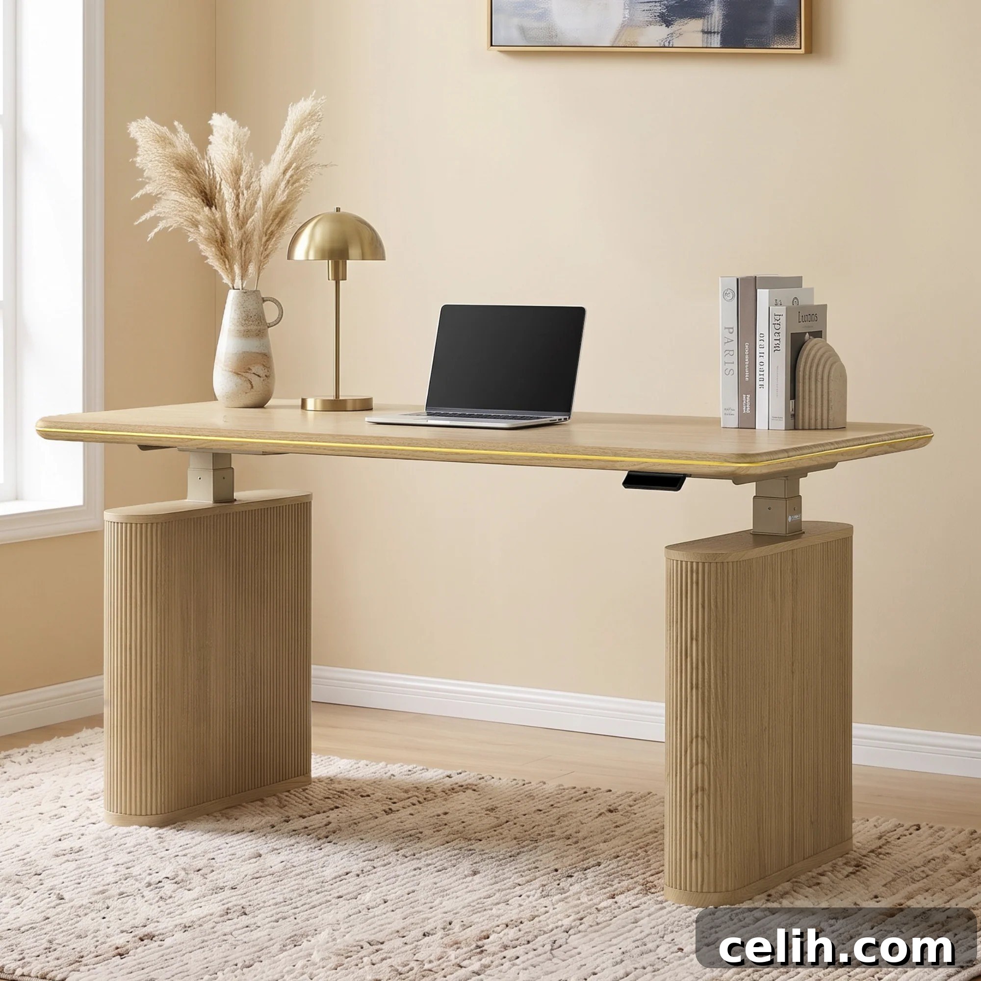
If you recently simplified your home office, you probably noticed how calm and collected the space feels. Clear surfaces, neutral colors, and fewer visual distractions make the room easy to settle into. That simplicity can be restorative, but after a few days the room may begin to feel a little flat or unfinished — as if something subtle is missing.
The instinct might be to add more decoration, but piling on objects, patterns, and finishes risks disrupting the peaceful atmosphere you worked to create. A better approach is to add a few intentional contrasts that introduce visual depth without clutter. This article describes how to introduce texture and interest in a restrained, thoughtful way so your home office remains calm yet visually engaging.
Table of Contents
- Start with One Textured Focal Point
- Contrast Texture with Something Smooth
- Let a Woven Textile Echo the Wood Tone
- Pause Before You Add Anything Else
- Endnote
Start with One Textured Focal Point
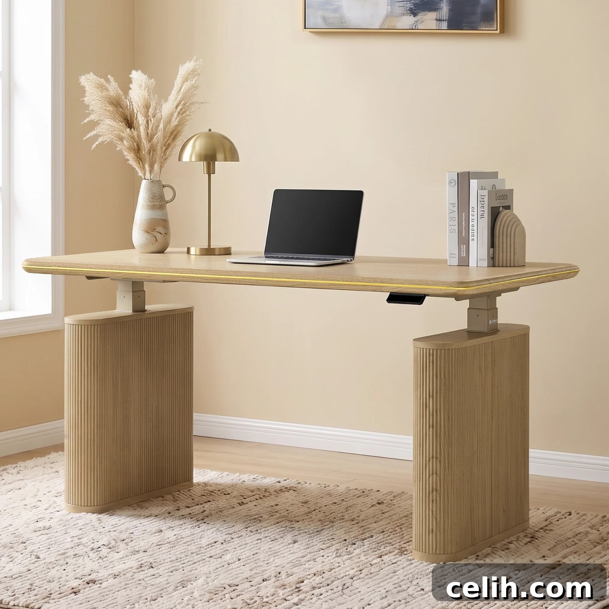
When an office reads as visually plain, a single statement piece can become a clear focal point without creating too much distraction. Choose something with subtle detailing and a sculptural quality rather than bold color or overly complex ornamentation. The goal is to add movement and tactility so the eye has a place to rest and return to.
A desk with vertical fluting, a subtly rounded silhouette, or another restrained surface detail can do this beautifully. Fluted surfaces create a repeated vertical rhythm that reads as texture from a distance but remains understated up close. Placing a single textured piece against a neutral backdrop allows it to anchor the room visually without overwhelming the calm you’ve established.
Contrast Texture with Something Smooth
Resist the temptation to repeat the same finish across multiple objects. If you already have a piece with pronounced texture, adding more objects with identical or very similar detailing can make the space feel busy instead of balanced.
A better strategy is to pair texture with smooth, simple surfaces. For example, place a textured desk next to a lamp with a clean-lined shade or a matte metal base. The plain surface gives the eye a place to rest and highlights the texture by contrast. The same applies to desktop accessories: keep them minimal, with simple shapes and finishes that support rather than compete with the textured piece.
This kind of contrast — textured versus smooth — creates visual hierarchy. It makes the textured element read as intentional and expressive while preserving a sense of calm and order in the room.
Let a Woven Textile Echo the Wood Tone
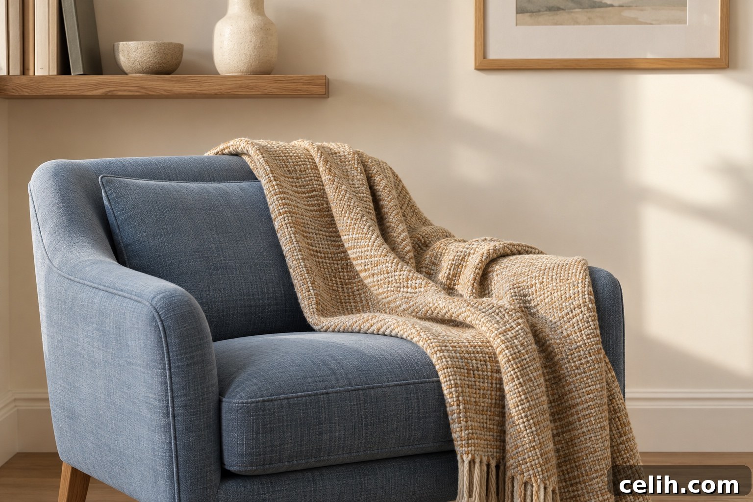
Introduce a soft textile nearby that loosely echoes the warm tone of any wooden surfaces without matching them exactly. A low-pile woven throw or a subtly textured cushion in a warm neutral can connect to the wood’s grain and color while still offering variation.
This echoing effect ties elements of the room together, creating cohesion without a contrived match. The weave provides a softer counterpoint to structured fluting or other rigid textures, adding a gentle secondary layer of interest without increasing visual clutter.
Choosing textiles with simple weaves and natural fibers supports a relaxed, tactile look that feels intentional and comfortable. These small textile choices can significantly affect how welcoming and lived-in your office feels, while maintaining the pared-back aesthetic you want.
Pause Before You Add Anything Else
After placing a primary textured piece and a few complementary elements, stop. It’s tempting to continue layering in more patterns, a gallery wall, or an ornate rug, but restraint is crucial. The textured focal piece carries visual weight, and the surrounding space benefits from openness rather than additional competition.
Keep the desktop uncluttered and the surrounding surfaces clear. Practical features like hidden cable management and easy height adjustment are useful precisely because they remain unobtrusive; they support a tidy look without drawing attention. Let practical details do their job quietly in the background.
If you do add accessories later, be selective: choose one or two supplementary pieces that either provide contrast or reinforce the quiet palette. Avoid repeating the same textured language over and over; instead, aim for balance between tactile interest and serene negative space.
Endnote
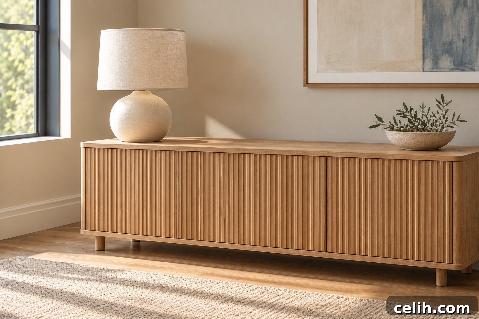
When you return to your home office after making these small changes, you may not notice a dramatic transformation — and that’s precisely the point. The room remains calm, the colors and layout unchanged. What shifts is the way the space feels: a few deliberate contrasts and textures provide depth and warmth without clutter. A calm room doesn’t need more objects; it needs a thoughtful selection of textures that work harmoniously to enhance the atmosphere.