
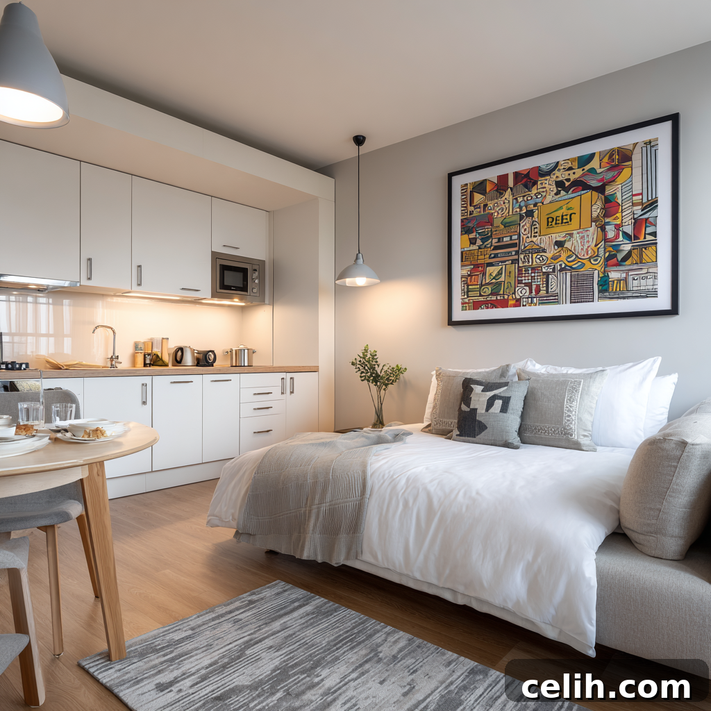
Living in a studio apartment, especially one under 400 square feet, presents a unique and exciting design challenge. Far from being a limitation, compact living spaces offer a blank canvas for creativity and strategic thinking. The true art lies in understanding how visual elements can profoundly transform perceived space, making even the coziest quarters feel open, organized, and intentionally designed. With a thoughtful approach to wall art selection and placement, even the most compact studio can achieve maximum visual impact while maintaining optimal functionality and reflecting personal style.
The landscape of home decor is constantly evolving, and according to Rently’s 2025 Apartment Design & Decor Trends Report, renters are increasingly making intentional design choices. The focus is shifting towards creating spaces that feel curated, stylish, and refreshingly free from clutter. This trend towards purposeful decorating means budget-conscious renters are actively seeking affordable posters and wall art that can deliver significant visual punch without necessitating major renovations or substantial financial outlays. The core challenge then becomes how to strategically select and position these pieces to create the illusion of expanded space, all while seamlessly integrating with and enhancing individual aesthetic preferences.
Elevating Your Space: The Power of Verticality and Height Illusion
One of the most impactful strategies for visually expanding limited square footage in small studio apartments involves skillfully drawing the eye upward. This technique, known as creating vertical flow, makes ceilings appear higher and rooms feel considerably more expansive than their actual dimensions. The key is the strategic vertical placement of artwork. Instead of hanging pieces at the conventional eye level typical of larger rooms, consider positioning larger, statement artworks higher on the walls. This creates an uninterrupted upward visual trajectory, instantly adding a sense of grandeur and airiness to the space.
To maximize this effect, choose artwork that inherently features vertical elements. Think tall, slender trees, dramatic architectural photography emphasizing vertical lines, or abstract designs with strong, ascending visual pathways. These specific imagery choices naturally encourage the eye to travel upwards, reinforcing the illusion of increased height. For a truly dynamic statement, consider designing a gallery wall that extends significantly from mid-wall height almost to the ceiling. This approach is not merely about covering wall space; it’s about crafting a cohesive narrative that stretches vertically, using pieces of varying sizes arranged in an ascending or staggered pattern. When creating such a display, consistency in spacing between pieces is crucial to ensure the arrangement feels intentional and curated, rather than haphazard or cluttered, maximizing both visual impact and spatial efficiency.
When curating artwork for vertical emphasis, the choice of background and composition is paramount. Opt for pieces with light backgrounds, ample negative space, or open compositions that do not visually weigh down the room. Artwork featuring expansive landscapes, delicate minimalist line drawings, or vibrant botanical prints with plenty of white space are exceptionally effective. They contribute to this upward momentum while simultaneously maintaining the clean, light, and curated aesthetic that defines successful small-space interior design. These choices prevent the walls from feeling heavy or enclosed, instead promoting a sense of lightness and openness.
The psychological impact of vertical placement extends far beyond simple visual tricks. Research in environmental psychology suggests that drawing attention upward activates similar spatial processing mechanisms that make vast outdoor environments feel expansive. By incorporating tall, narrow formats or artfully arranging vertical groupings of smaller pieces, you can trigger these same deep-seated psychological responses within your compact living space. This thoughtful application of design principles can make a studio apartment feel significantly larger, more open, and more welcoming than its true physical dimensions might suggest. It’s an effective way to leverage psychological perception to enhance daily living in smaller environments.
Mastering Light and Color for Expansive Appeal: Strategic Psychology in Art
In the realm of limited square footage, the strategic selection of color in poster art becomes an indispensable tool. Certain hues possess the remarkable ability to either expand or contract the perceived size of a space. To foster an open and airy ambiance, gravitate towards light, cool colors such as soft blues, calming pale greens, and serene warm whites. These colors are inherently reflective, bouncing natural light around the room and creating an illusion of spaciousness. Incorporating artwork that features these palettes, particularly pieces with significant white or negative space, is vital. It ensures visual breathing room, preventing the walls from feeling overwhelming even when decor is plentiful.
Beyond color, mirror-like effects within artwork can dramatically enhance a studio’s luminosity and sense of depth. Seek out pieces that incorporate reflective elements, such as tranquil water scenes, depictions of sleek glass architecture, or art with subtle metallic accents. These pieces don’t just hang on the wall; they actively engage with the environment, capturing and bouncing available light throughout the room. This interplay of light creates dynamic depth and a luminous quality that effectively counters the often-closed-in feeling associated with small studios. For maximum impact, position such artwork strategically opposite or adjacent to windows, allowing them to amplify natural light and expand the visual space throughout the day. Consider even art with a glossy finish to subtly enhance this reflective quality.
Embracing a monochromatic color scheme in your wall art is another powerful technique for creating visual continuity and making spaces feel more cohesive and expansive. Rather than introducing a multitude of competing colors that can fragment the visual field, select posters that adhere to a limited palette of two to three complementary shades. This sophisticated approach prevents visual fragmentation, allowing the eye to flow smoothly across the wall without interruption, thereby making the space feel larger and more unified. Within these monochromatic constraints, ample opportunity remains for expressing personality and style through variations in texture, pattern, and subject matter.
Current social media trends, particularly those popularized on platforms like TikTok, have significantly influenced design preferences, leaning towards visually striking statement pieces that photograph beautifully under diverse lighting conditions. This trend, surprisingly, offers considerable benefits for small-space dwellers. Many of these “camera-ready” designs feature the bold simplicity and high contrast that excel in compact environments. They often employ minimalist compositions and clean lines, which, when combined with the principles of color psychology, can make a significant difference in how a small studio is perceived. By choosing art that aligns with both timeless spatial principles and contemporary aesthetics, you can create a studio that is not only functional but also visually captivating and on-trend.
Defining Zones and Enhancing Functionality Through Artistic Placement
In the integrated environment of a studio apartment, where living, sleeping, and kitchen areas often coexist within a single open space, artwork placement transcends mere decoration to become a potent tool for functional design. Strategically placed art can create psychological separation, effectively delineating distinct functional zones without the need for physical barriers. For instance, positioning a striking abstract print or a serene landscape above the sleeping area can powerfully anchor it as a dedicated sanctuary for rest. Similarly, food-themed artwork, vibrant still lifes, or prints with geometric patterns can reinforce the purpose of a kitchen zone, making it feel like a defined culinary space.
The scale relationship between artwork and existing furniture is critical for successful zone definition. Counter-intuitively, in compact spaces, slightly oversized pieces can actually make an area feel more substantial, important, and complete, provided they are chosen with careful consideration for the room’s overall proportions. For example, a single, generously sized poster or a vertically oriented triptych positioned above a small dining table can transform that corner into a legitimate dining area, rather than simply an unused or leftover space. This bold choice creates a strong visual anchor that grounds the zone, giving it identity and purpose.
Strategic placement at eye level within each defined zone creates intimate focal points that encourage the brain to perceive separate “rooms” within the open studio layout. This clever psychological trick helps to combat the potentially overwhelming feeling of inhabiting one large, undifferentiated space. Simultaneously, it maintains the open flow that is characteristic of studio apartments and contributes to making them feel less cramped. By giving each area its own distinct visual marker, you provide the brain with cues that delineate boundaries, even when none physically exist.
To further enhance this segmentation, consider implementing a cohesive theme that elegantly weaves through your entire studio, while varying the specific imagery to reinforce each area’s function. For instance, a unifying nature theme could feature tranquil forest scenes in the sleeping area to promote calm and rest, shift to vibrant botanical close-ups or fresh herb illustrations in the kitchen for a sense of vitality, and then expand to sweeping landscape vistas in the living space to evoke openness and connection. This sophisticated approach not only creates a sense of unity and flow throughout the apartment but also clearly delineates different functional areas, making the entire space feel more intentional and organized.
The culmination of these thoughtful design strategies results in a studio apartment that feels both surprisingly spacious and meticulously organized. This intentional design aesthetic is a hallmark of successful small-space living in 2025. By approaching each functional zone as if it were a distinct room with its own unique artistic identity, you can effectively transform a single, compact space into an environment that psychologically feels like a multi-room apartment. This maximizes both the functional utility and the psychological comfort of your compact living environment, proving that small spaces can indeed live large.