
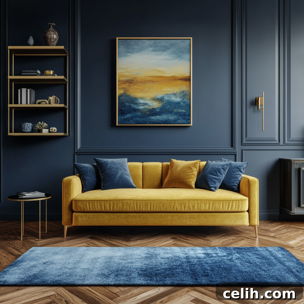
It’s easy to relegate primary colors to children’s spaces like playrooms and nurseries, associating them with a juvenile aesthetic. Bright reds, blues, and yellows often feel inherently bold, even overwhelming, especially when the goal is to cultivate a serene, sophisticated adult home environment. However, this perception overlooks the profound impact these foundational hues can have.
When employed with intention and a thoughtful approach, primary colors possess an unparalleled ability to transform a space entirely. They inject rooms with dynamic energy, inviting warmth, and undeniable personality, making a home feel more lived-in, vibrant, and uniquely yours. The critical insight lies not in avoiding them, but in mastering the art of their application to achieve sophistication without tipping into an overly stimulated or childish aesthetic.
If you’ve ever found yourself captivated by the allure of bold color, yet hesitated, unsure how to seamlessly integrate it into your decor, then exploring primary colors might just offer the surprising and elegant solution you’ve been seeking for a truly distinctive interior.
Understanding Primary Colors: The Foundation of Interior Aesthetics
At their core, the three primary colors in traditional color theory are red, blue, and yellow. These are fundamental hues that cannot be created by mixing any other colors. Instead, they serve as the building blocks for virtually every other shade across the entire color spectrum, forming the very basis of our visual world.
However, within the realm of interior design, the term “primary colors” is often interpreted with a touch more flexibility. When designers and homeowners discuss “primary color schemes,” they are typically referring to bold, highly saturated shades that draw their inspiration from these core three. This expansive interpretation might encompass vibrant greens, lively oranges, or rich purples, used alongside the more traditional trio of red, blue, and yellow. The emphasis shifts from strict adherence to color science to the powerful, immediate impact these saturated shades create in a living space.
Ultimately, what holds the most significance in interior decor isn’t rigid color theory, but rather the emotional resonance these shades evoke, how they influence the atmosphere of a room, and how harmoniously they integrate within the broader context of your home’s aesthetic. It’s about feeling, mood, and personal expression, guided by the foundational principles of color.
The Psychological Impact of Primary Colors in Your Home
Primary colors, perhaps more than any other segment of the color palette, are deeply intertwined with distinct and powerful emotions. Their fundamental nature means they often elicit immediate and strong psychological responses, making them invaluable tools for shaping the mood and energy of any room.
Red: Warmth, Energy, and Connection
Red stands out as the most assertive and dynamic of the primary shades. It is universally associated with intense emotions such as passion, romance, warmth, and vitality. In design, red can be a powerful catalyst for energy and conversation, making it an excellent choice for social gathering spaces. Think living rooms, dining rooms, or entryways where you want to foster a sense of activity and engaging connection. However, its high energy can be counterproductive in areas meant for rest. It is generally too stimulating for bedrooms, where calm and relaxation are paramount. To harness red’s power without overwhelming a space, consider it in smaller doses – perhaps a striking accent wall, a collection of vibrant cushions, a single statement armchair, or carefully chosen artwork. These strategic applications allow its warmth and personality to shine through without dominating the entire room, creating a sophisticated pop rather than an intense wash.
Blue: Calm, Balance, and Quiet Sophistication
Blue remains one of the most consistently popular choices in interior design, and for good reason. It is inherently linked to nature, evoking the serene vastness of the sky and the calming depths of the ocean. This association translates into feelings of tranquility, stability, and peacefulness. Consequently, blue is an ideal choice for private sanctuaries like bedrooms, bathrooms, or home offices where a sense of calm and focus is desired. However, blue has a cool undertone that, if not carefully managed, can make a room feel chilly or stark, especially in spaces with limited natural light or when an overly strong shade is chosen. To counteract this potential coolness, pair blue with warm, inviting materials. Natural wood tones, gleaming brass accents, soft wool throws, or plush velvet textiles can introduce crucial warmth and texture, ensuring the room feels balanced, welcoming, and comforting, rather than cold or aloof.
Yellow: Light, Optimism, and Radiant Warmth
Yellow is the epitome of cheerfulness and light. It is inextricably linked with sunshine, happiness, and an uplifting sense of optimism and energy. This makes it an incredibly effective color for brightening spaces that might otherwise feel dark or subdued. Yellow excels at reflecting light, instantly making a room feel more expansive and inviting, even on a cloudy day.
It is an outstanding choice for kitchens, where its vibrancy can stimulate appetite and conversation, or for hallways and entryways, where it can provide a cheerful welcome. Any room that naturally lacks sunlight and needs an infusion of brightness and joy can benefit greatly from yellow. The versatility of yellow means you can choose from a wide spectrum of shades. Softer tones, such as buttery creams, pale ochres, or muted mustards, work beautifully on larger surfaces like walls, providing a gentle warmth without overwhelming. Brighter, more saturated yellows can be reserved for thoughtful accents – a vibrant vase, sunny cushions, or a piece of art – to add a lively touch of optimism and personality without dominating the entire aesthetic.
Why Primary Colors Elevate Your Home Decor
Primary colors possess an inherent clarity and unwavering confidence that softer, more muted shades often lack. They command attention, immediately catch the eye, and possess the unique ability to instantly infuse a room with life and character. They don’t shy away; they make a statement.
This powerful presence doesn’t, however, necessitate decorating an entire space in bold, saturated hues. In fact, quite the opposite approach often proves far more effective and sophisticated. When judiciously and thoughtfully applied in smaller doses, primary colors can achieve several transformative effects:
- Invigorate Neutral Rooms: They effortlessly lift a room dominated by neutral tones, preventing it from feeling bland or monotonous. A splash of primary color provides a much-needed jolt of visual interest and vibrancy.
- Inject Warmth and Personality: Beyond mere color, they bring a distinct emotional warmth and a unique personality to your decor, making a space feel less generic and more invitingly intimate.
- Create Striking Focal Points: They naturally draw the eye, establishing clear focal points without the need for excessive clutter. A single, bold primary piece can anchor a room and direct attention.
- Reflect Your Unique Style: Ultimately, they help a space feel more genuinely “you.” Using primary colors is a confident expression of personal taste, allowing your home to tell your story in a vivid way.
The essence of successful primary color integration is less about a maximalist “all-in” approach and more about using these vibrant shades with precise intention and strategic placement.
Strategic Integration: How to Use Primary Colors Without Overdoing It
This is often the most significant hurdle for homeowners. The desire for bold color is present, but it’s frequently overshadowed by the apprehension of making a design mistake. The most effective and confidence-building strategy is to begin modestly and gradually build up as you become more comfortable and assured in your choices.
Start Small with Accent Pieces
One of the simplest and most forgiving methods for introducing primary colors is through carefully selected accessories and accent pieces. Consider items such as plush cushions, luxurious throws, decorative vases, stylish lampshades, or impactful artwork. Imagine a bright yellow armchair or a set of deep blue velvet cushions placed within an otherwise neutral living room. Such additions create a powerful visual impact and infuse character without feeling overwhelming or permanent. This approach also offers immense flexibility; if your tastes evolve or you simply crave a change, these smaller items are effortless and inexpensive to swap out.
Let Neutrals Do the Grounding
Primary colors achieve their full potential and look their most sophisticated when they are juxtaposed against a strong, calming counterbalance. Neutrals are the unsung heroes in this equation. Whites, soft greys, warm beiges, and natural materials like rich wood or rugged stone provide essential grounding. They anchor the vibrant shades, preventing them from dominating the room and instead allowing them to pop with purposeful energy. This intentional contrast between bold and muted is what makes the color feel curated and sophisticated, rather than chaotic or accidental. Neutrals provide the quiet backdrop against which your primary colors can truly sing.
Repeat Colors for a Cohesive Look
A single, isolated bright item can sometimes appear out of place or unintentional. To avoid this, subtly repeating the same color in a few small ways throughout the room helps to tie the entire design together and create a sense of cohesion. For instance, if you introduce a bold blue vase, you might echo that blue with a subtle pattern in a throw cushion, a detail in a piece of artwork, or even a small book cover on a shelf. These quiet repetitions reinforce the color choice without being overly obvious, creating a harmonized and thoughtfully designed space.
Embrace Color Blocking for Modern Appeal
If your confidence has grown and you’re ready for a more pronounced statement, color blocking offers an exciting and deliberate way to integrate primary shades. This technique involves using distinct blocks of color, often side-by-side, within the same space. For example, you might pair a large block of vivid blue with a complementary section of bright yellow on an accent wall, or use red and blue in distinct zones. Color blocking adds significant depth, modern interest, and architectural definition to a room, ensuring that no single color overwhelms. The key to successful color blocking is maintaining relative simplicity in the surrounding decor, allowing the bold color blocks to truly stand out as the room’s artistic focal point.
Practical Ideas for Introducing Primary Colors at Home
If you’re feeling inspired but unsure where to begin your primary color journey, these accessible ideas provide excellent starting points to experiment and find what resonates with your personal style:
- Textile Transformations: Instantly refresh a neutral sofa by adding a selection of vibrant, colorful cushions or draping a striking throw in a primary hue. This is a low-commitment, high-impact change.
- Artistic Statements: Introduce bold and expressive artwork featuring strong red, blue, or yellow tones. A single large piece or a curated gallery wall can anchor a room’s color scheme.
- Furniture Flips: Give a small, unassuming piece of furniture – such as a bedside table, a console, or an old cabinet – a new lease on life with a fresh coat of paint in a primary color. This creates an unexpected, charming focal point.
- Illuminating Accents: Use statement lighting as a design element. A bright lampshade, a colorful pendant light, or a sculptural lamp base in a primary shade can draw the eye upwards and add character.
- Shelf Styling: Elevate your shelving units or bookcases by arranging colorful books with vibrant spines, interspersed with decorative accessories like vases, figurines, or small sculptures in primary tones.
For those ready to venture further, consider a feature wall painted in a primary color, or transforming an alcove with a bold shade. However, always remember the golden rule: test a sample swatch of the color in your actual space first, observing how it looks under different lighting conditions throughout the day, before committing to a larger application. This ensures the shade feels right for your home’s unique ambiance.
Harmonious Combinations: Simple Primary Color Pairings That Work
If the idea of mixing multiple bold colors feels intimidating, starting with tried-and-true combinations can build confidence and ensure a cohesive aesthetic. These pairings are inherently balanced and visually pleasing:
- Blue and Yellow: This classic combination is perpetually fresh, uplifting, and beautifully balanced. Evoking the sky and the sun, it creates a sense of openness, clarity, and warmth. It’s versatile enough for any room, from a vibrant kitchen to a cheerful bedroom, offering both energy and calm simultaneously.
- Red and Blue: A strikingly bold yet inherently grounded pairing, red and blue can feel both dynamic and sophisticated. This combination often evokes a classic, almost nautical or patriotic feel, but can also be incredibly modern when used with intention. The coolness of blue tempers the intensity of red, creating a harmonious tension that adds depth and drama.
- Yellow and Red: This duo radiates warmth and energetic vibrancy. It’s a particularly stimulating and inviting combination, best utilized in moderation to prevent it from overwhelming the senses. Ideal for areas where you want to foster activity and enthusiasm, such as a dining nook or a creative workspace, it brings an immediate sense of cheer and vitality.
Often, sticking to two main primary colors, complemented by a strong neutral base, rather than attempting to incorporate all three primaries simultaneously, leads to a more refined, sophisticated, and cohesive design aesthetic.
A Simplified Approach to Confident Color Use
For those drawn to the allure of primary colors but preferring a streamlined, low-stress method, this systematic approach ensures beautiful results without feeling overwhelmed:
- Choose One Dominant Primary: Select one primary color that truly speaks to you and the mood you wish to create in the room. This will be your main accent hue.
- Add One Supporting Primary: Introduce a second primary color to complement your dominant choice. This creates visual interest and depth without chaos.
- Anchor with Neutrals: Utilize whites, greys, beiges, and natural wood tones extensively. These neutrals will balance the vibrant primaries, providing a sophisticated backdrop and preventing the space from feeling too busy.
- Echo Colors in Small Details: Reinforce your chosen primaries by repeating them subtly in various small details around the room – a cushion, a decorative object, a framed print. This creates a cohesive flow.
- Build Slowly and Incrementally: Avoid the temptation to overhaul everything at once. Introduce elements gradually, observe how they feel in your space, and make adjustments as you go.
By adopting this mindful and incremental strategy, your home’s aesthetic will naturally evolve into a vibrant, personal, and inviting space, rather than feeling forced or overly decorated.
Final Thoughts: Embracing Primary Colors with Confidence
Primary colors are far from being restricted to childish decor or overwhelming statements. When approached with thoughtfulness, an understanding of their psychological impact, and a strategic eye for placement, they possess an unparalleled ability to infuse your home with warmth, distinctive personality, and a dynamic sense of energy. This level of vibrancy and character is often unattainable with more subdued or monochromatic palettes.
The true mastery lies in utilizing them in a manner that feels genuinely comfortable and reflective of your own personal style. Begin with small, manageable steps, allowing yourself to experiment and trust your intuition. There’s no pressure to achieve absolute perfection from the outset. A home that feels authentically lived-in, deeply personal, and infused with chosen vibrant accents will invariably be more inviting, memorable, and cherished than one that simply plays it safe. Dare to be bold, and let primary colors unlock the full potential of your living spaces.