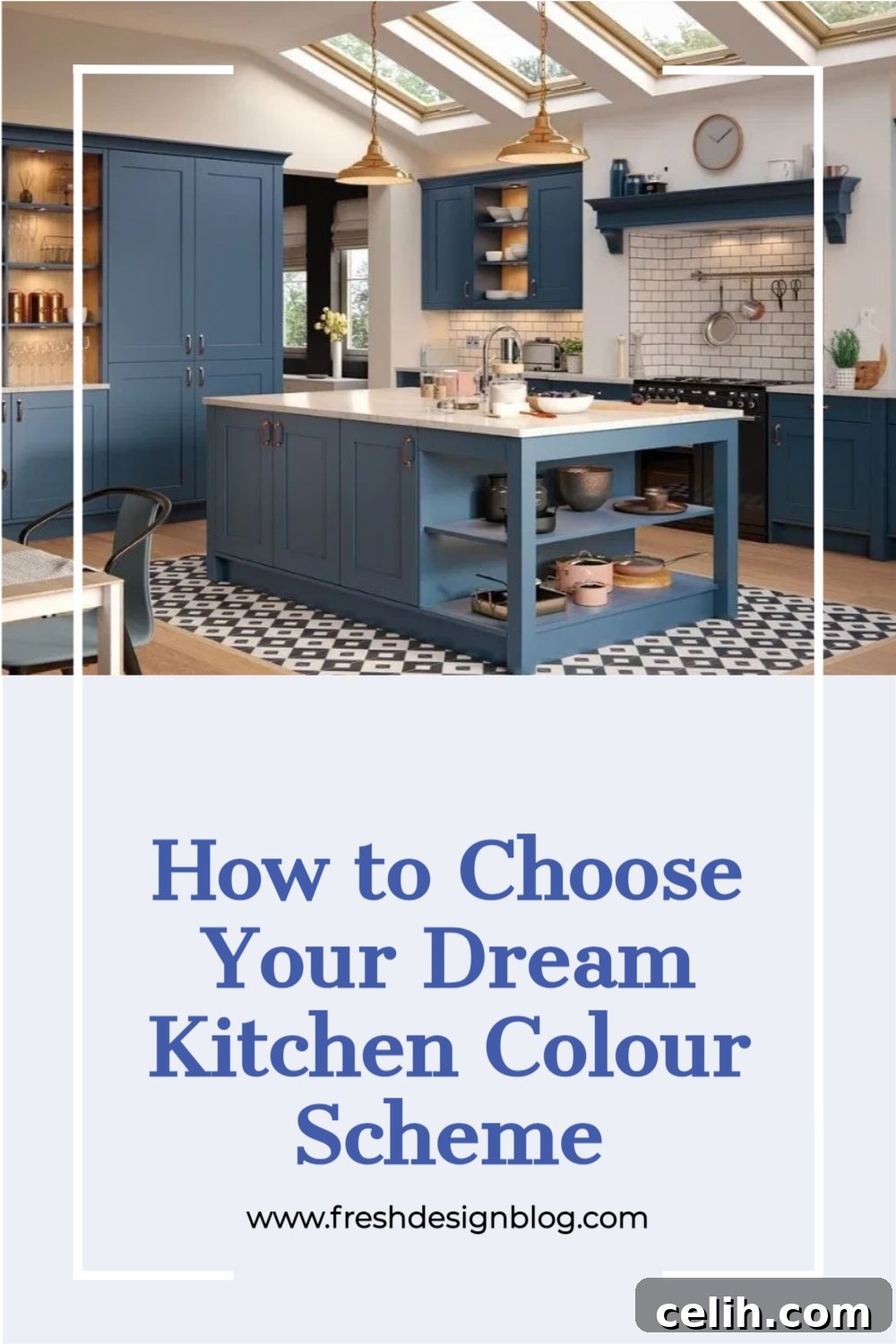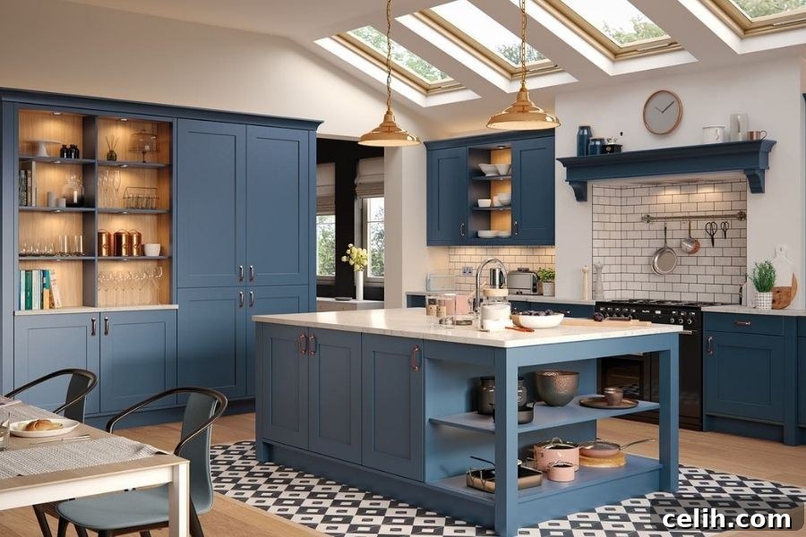
The kitchen is often considered the heart of the home, a vibrant hub where culinary creativity flourishes, families gather, and memories are made. As such, choosing the perfect colour scheme for this crucial space is not merely a design choice; it’s the foundational step towards a successful renovation and a reflection of your personal style. A well-selected palette can dramatically influence the mood, functionality, and perceived size of your kitchen, transforming it into a space you truly love.
However, many homeowners find themselves overwhelmed when faced with a myriad of colour options. The journey to selecting the ideal hues can feel daunting, whether you’re starting from scratch or looking to refresh an existing design. If you’re struggling with where to begin or how to weave together different tones and shades harmoniously, we are here to help guide you. This comprehensive guide will explore the art and science of kitchen colour design, ensuring your space is not only beautiful but also perfectly tailored to your lifestyle.
Mastering Colour Theory: Understanding Your Options for a Cohesive Kitchen
Before you even begin to contemplate the subtle differences between various shades of grey or the vibrancy of a particular blue, it’s essential to grasp the fundamentals of individual colour schemes and how they interact. Understanding colour theory isn’t just for professional designers; it empowers you to make informed decisions that result in a truly cohesive and aesthetically pleasing kitchen.
A simple yet powerful tool in this process is the colour wheel. This visual aid demystifies how colours relate to one another, helping you identify shades that naturally complement each other and those that create dynamic contrasts. It illustrates primary colours (red, yellow, blue), secondary colours (green, orange, purple, formed by mixing two primaries), and tertiary colours (mixtures of a primary and a secondary colour). By understanding the relationships on the wheel, you can move beyond guesswork and approach your colour choices with confidence.
For those who desire an even deeper exploration or face particular design challenges, consulting an interior design professional can be invaluable. These experts bring a wealth of knowledge and an objective perspective, often considering options you might not have even imagined. They can help you navigate complex colour interactions, understand the nuances of light reflection, and ensure your chosen palette aligns perfectly with your home’s overall aesthetic and your personal preferences.
Unlocking Harmony: Complementing Tones with the Colour Wheel
The colour wheel is an indispensable tool for anyone delving into interior design, offering a clear roadmap to creating harmonious colour schemes. It allows you to identify an array of different colour matching options, each with its own unique visual impact.
One of the most widely recognised principles is that of **complementary colours**. These are two hues positioned directly opposite each other on the colour wheel, such as red and green, blue and orange, or yellow and purple. When used together, complementary colours create a striking visual contrast that can make a kitchen feel vibrant and energetic. While often associated with bold statements, they can also be applied more subtly by varying their shades and tones, for example, a muted sage green paired with a terracotta accent.
Beyond complementary colours, the wheel helps us explore other sophisticated schemes:
- Analogous colours are three colours that are next to each other on the colour wheel, like blue, blue-green, and green. This scheme offers a sense of serenity and harmony, as the colours naturally blend, creating a calm and flowing aesthetic ideal for a tranquil kitchen environment.
- Triadic colours are three colours evenly spaced around the colour wheel, such as red, yellow, and blue. This scheme provides strong visual contrast while maintaining balance and richness. It’s often used to create a playful or bold look.
- Monochromatic schemes involve using various shades, tints, and tones of a single colour. This approach offers elegance and sophistication, creating depth and interest through subtle variations without introducing additional hues. Imagine a kitchen with different shades of grey, from charcoal cabinets to a light grey backsplash, accented by stainless steel.
As you browse colours for your home, understanding these principles helps you move away from the typical primary colours and begin to appreciate how different shades and tones work in harmony to create a gorgeous, custom-designed colour scheme that truly reflects your vision for the kitchen.
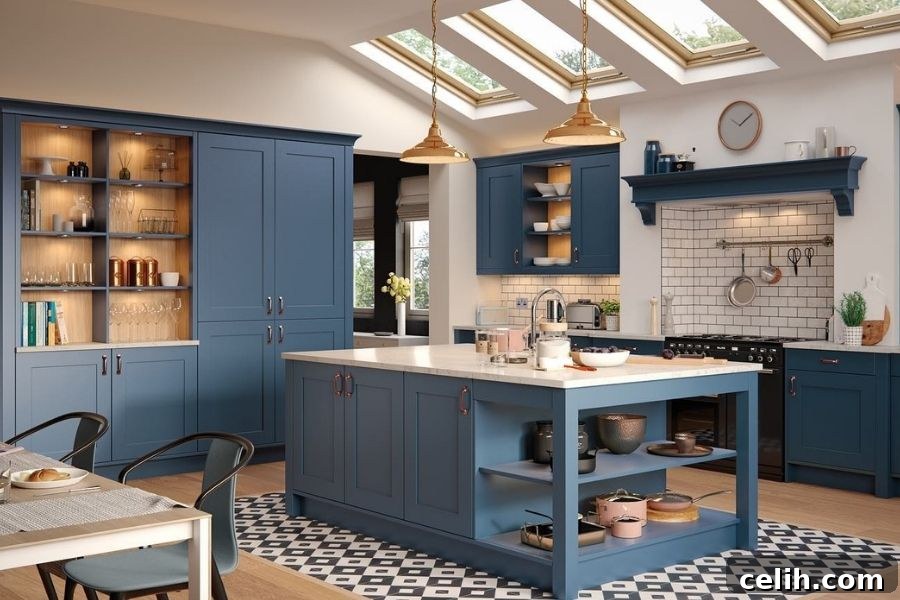
Defining Your Vision: Finding a Theme for Your Dream Kitchen
Every successful kitchen design starts with a clear vision, and often, this vision is encapsulated in a particular theme. You might already have a specific style in mind – perhaps you’ve been dreaming of a sleek modern kitchen or a rustic farmhouse retreat – or you might be completely open to possibilities. Both approaches are perfectly valid, as long as you take the time to explore and refine your aesthetic preferences.
For some, the appeal of a particular theme is undeniable, and they seek to replicate that exact style within their home. This often means researching specific design elements, material choices, and, of course, colour palettes associated with that theme. For instance, a **Scandinavian kitchen** typically features clean lines, minimalist design, light wood tones, and a palette dominated by whites, greys, and muted pastels, creating an airy and functional space. A **Traditional kitchen**, on the other hand, might embrace richer wood finishes, ornate detailing, and warmer, deeper colour schemes like creams, greens, and burgundies.
Others prefer a more eclectic approach, either combining elements from different themes to create a unique hybrid or crafting something entirely bespoke that speaks to their individuality. This requires a keen eye for balance and an understanding of how different styles can coexist without clashing. For example, you might blend the industrial chic of exposed brick with the warmth of a farmhouse sink, softened by a contemporary colour palette.
Regardless of whether you choose a specific, well-defined theme or opt for a unique, custom blend, it’s crucial to dedicate time to consider the overall style you envision for your kitchen. This foundational decision will significantly influence your colour choices, helping you adapt or enhance any particular shades you already have in mind. For instance, if you adore the calm simplicity of a Scandinavian style, but your current space is naturally darker and smaller, you might need to adapt your chosen colours to lighter variations of the theme to ensure it works effectively. Using this time wisely to pinpoint your desired theme can either provide a definitive starting point for your colour scheme or powerfully influence the aesthetic you wish to achieve.
Harmonising with Your Space: Working with Your Kitchen’s Unique Characteristics
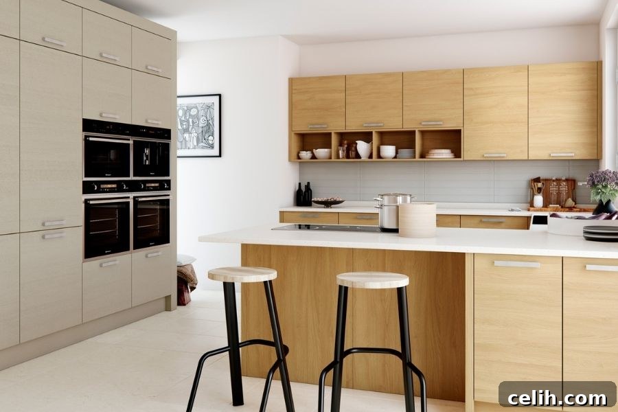
While everyone has the freedom to choose any colours they desire, a truly successful kitchen design respects and responds to the unique characteristics of the space itself. We’ve all been there: falling in love with a particular shade, being absolutely adamant that it’s “the one,” only to realise upon application that it doesn’t quite suit the room. It’s a frustrating and often costly mistake. Instead, investing time to understand your kitchen’s natural lighting, size, and existing elements before committing to a colour can save you from this common pitfall.
**Natural Light:** The amount and direction of natural light are perhaps the most critical factors. A kitchen that receives abundant light from south-facing windows can often handle bolder, deeper colours without feeling dark. Conversely, a north-facing kitchen, which typically receives cooler, indirect light, often benefits from warmer, lighter colours to prevent it from feeling cold and dim. East-facing kitchens get bright morning light, making them suitable for cooler tones, while west-facing kitchens bask in warm afternoon light, allowing for a wider range of colour choices.
**Artificial Lighting:** Don’t forget the impact of your artificial lighting. Different bulbs emit different colour temperatures (warm white, cool white, daylight), which can dramatically alter how colours appear on your walls and cabinets. Always test paint swatches under both natural and artificial light conditions.
**Room Size and Layout:**
If you have a dark, smaller kitchen space, opting for dark colours across all surfaces will almost certainly make the room feel even smaller, more compact, and enclosed. For many, this is the opposite of the desired effect. Instead, consider shades that help bounce and reflect the natural light your kitchen brings in. Light, reflective colours like crisp whites, pale greys, or soft pastels can visually expand the space, making it feel more open and airy. Adding colourful elements through accessories or a single accent wall can bring life and personality without overwhelming the room.
On the opposite side of the spectrum, if you feel your large kitchen area is currently too bright or lacking intimacy, you have more flexibility. You could explore darker options, like deep blues, forest greens, or even charcoal greys, for cabinets or an accent wall. Experiment with richer shades within your chosen theme to create depth, add sophistication, and highlight main focal points, such as an island, a beautiful range hood, or specific architectural features. Darker colours can make a large, open-plan kitchen feel more grounded and inviting.
Finally, consider existing fixed elements like your flooring, countertops, and even the colours of adjacent rooms. Your kitchen colour scheme should ideally flow seamlessly with these elements, creating a harmonious transition throughout your home.
Igniting Creativity: How to Be Inspired for Your Kitchen Colour Scheme
If you’re feeling utterly clueless about where to begin your colour journey, take heart – inspiration is everywhere, and taking the time to seek it out is a crucial and enjoyable part of the design process. Rather than seeing a blank canvas as a problem, view it as an exciting opportunity to explore a world of possibilities.
In the digital age, platforms like Pinterest and Instagram are treasure troves of home inspiration. You can find thousands upon thousands of accounts dedicated to interior design, showcasing stunning kitchens in every style and colour imaginable. Start by exploring broad terms like “modern kitchen colours,” “farmhouse kitchen ideas,” or “blue kitchen cabinets.” As you scroll, save any images that resonate with you to your own virtual mood boards. You’ll quickly begin to notice patterns – recurring colours, textures, finishes, and styles that you instinctively adore. This curated collection will serve as an invaluable guide, helping you identify your core aesthetic preferences and translate them into a concrete design for your new kitchen.
But inspiration isn’t limited to digital screens. Venture beyond:
- Design Magazines and Books: Flipping through glossy pages offers a different tactile experience and often features professional photography and well-curated content.
- Showrooms: Visiting kitchen showrooms allows you to see colours and materials in real life, under various lighting conditions. You can touch textures and get a true sense of scale.
- Nature: The natural world is an endless source of breathtaking colour palettes. Think about the soothing greens and blues of a forest, the vibrant hues of a sunset, or the calming neutrals of a beach.
- Travel and Art: The architecture, art, and landscapes from places you’ve visited or admired can spark unique colour combinations.
- Interior Design Blogs: Beyond visual platforms, there’s an array of interior design blogs, just like Fresh Design Blog. These sites not only provide boundless inspiration but also offer practical advice, trend forecasts, and expert insights that can further enhance your interior design choices and help you refine your vision.
Remember, the goal is not to copy exactly, but to gather elements, analyse what you love about them, and then incorporate that essence into a design that is uniquely yours.
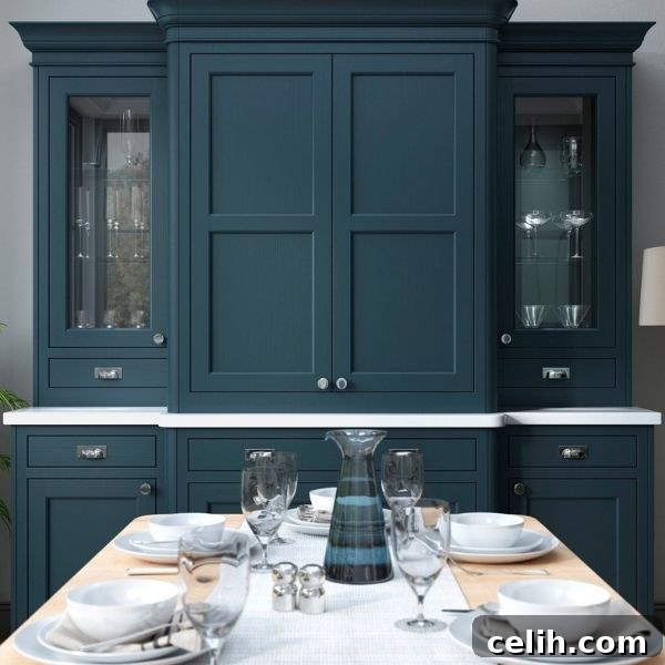
Beyond the Walls: Integrating Extras and Key Elements for a Complete Look
When curating your kitchen colour scheme, it’s easy to focus solely on wall paint or cabinet colours. However, neglecting the all-important additional features and fixed elements can lead to a disjointed look. These supporting components – such as your appliances, cabinets, countertops, flooring, and even decorative accessories – play a pivotal role in solidifying and enhancing your overall kitchen style.
Let’s delve into how each element contributes:
- Cabinets: Often the largest surface area in a kitchen, your cabinets are arguably the most significant colour decision. They establish the foundational tone. Consider two-tone schemes, with lighter upper cabinets for an airy feel and darker lower cabinets for grounding. The material also matters; natural wood tones add warmth, while painted cabinets offer limitless colour possibilities.
- Appliances: Modern appliances come in a variety of finishes beyond traditional stainless steel. Black stainless steel, matte black, white, and even custom-coloured ranges can dramatically influence the scheme. Choosing a bright coloured appliance, for instance, can act as a striking focal point, particularly when paired with a more subtle, neutral tone surrounding the rest of the room. This strategic contrast can help transform your kitchen space with minimal effort.
- Countertops: These functional surfaces are also major visual players. Materials like granite, quartz, marble, or butcher block come in a vast array of colours and patterns. A busy pattern might call for more subdued cabinet and wall colours, while a solid, neutral countertop can allow other elements to shine.
- Backsplash: The backsplash is a fantastic opportunity to introduce an accent colour, texture, or pattern without overwhelming the space. It can tie together the countertop and cabinet colours, or it can provide a burst of unexpected personality.
- Flooring: As the base of your kitchen, the flooring colour sets a vital backdrop. Light floors can make a room feel expansive, while darker floors add richness and stability. Ensure your flooring choice complements the overall colour temperature and style you’re aiming for.
- Hardware: Don’t underestimate the power of cabinet pulls and knobs. Finishes like brushed brass, matte black, polished chrome, or antique bronze can add a layer of sophistication and reinforce your chosen theme.
- Accessories and Textiles: These are the final touches that tie everything together. Curtains, rugs, bar stools, potted plants, artwork, and even small appliances like toasters and kettles can inject pops of colour, texture, and personality, bringing the entire scheme to life.
The walls are undoubtedly important, but the supporting elements are equally crucial in crafting a cohesive and captivating kitchen design. Choosing your dream colour scheme for your kitchen is a journey that requires careful consideration and patience. Don’t rush the process; instead, embrace the exploration. Taking the time to find the perfect colour choices and integrate all elements thoughtfully will not only transform your space into a beautiful and functional environment but also help you feel happier and more connected to your home for years to come.
Pin It!