
Colour, in its infinite spectrum from the deepest hues to the softest pastels, possesses an unparalleled ability to redefine the very essence of a home. More than just a superficial layer, colour choices are fundamental design decisions that shape perception, evoke emotion, and establish the overall atmosphere of any living space. Whether your vision involves a dramatic accent wall bathed in a daring teal or the comforting embrace of serene, earthy tones throughout, the strategic application of colour is a cornerstone of impactful home renovation. Navigating the vast world of colour can feel overwhelming, yet understanding its profound influence empowers homeowners to craft spaces that are not only aesthetically pleasing but also deeply personal and functional. This guide delves into how thoughtful colour selection can transform your home, moving beyond mere decoration to create environments that truly resonate with your lifestyle and aspirations.
The Profound Psychology and Emotional Impact of Color in Home Design
The impact of colour extends far beyond its visual appeal; it deeply influences our psychological state and the emotional tenor of our surroundings. Every shade carries an intrinsic psychological weight, capable of generating specific moods and reactions within a space. Understanding the psychology of color is crucial for any successful home renovation project, as it allows you to intentionally cultivate the desired emotional experiences in each room.
Consider the contrast between warm and cool colour palettes. Warm colours, such as vibrant reds, sunny yellows, and inviting oranges, are often associated with energy, passion, and comfort. They have a remarkable ability to make a large room feel cozier and more intimate, drawing people together. In a living room, a pop of red might stimulate lively conversation, while golden yellow in a kitchen can evoke a sense of warmth and hospitality, making it an ideal choice for spaces where family gathers and memories are made. These hues can ignite appetite, making them popular choices for dining areas.
Conversely, cool colours, including serene blues, refreshing greens, and sophisticated purples, are known for their calming and soothing effects. They promote feelings of tranquility, relaxation, and introspection. Bedrooms, bathrooms, and home offices often benefit greatly from these tones, as they foster environments conducive to rest, mindfulness, and concentration. Imagine a master bedroom painted in a soft, muted blue, offering a sanctuary of peace after a long day, or a home office in an invigorating shade of green that enhances focus and connection to nature. Choosing a colour palette, therefore, is not merely about following trends, but about curating the exact emotional landscape you wish to inhabit.
An effective home renovation thoughtfully considers the intended function of each space and how individuals will interact within it. For instance, while bright, lively colours can stimulate conversation in a living room, fostering a vibrant social atmosphere, muted and understated tones may be better suited for bedrooms and studies, inspiring calm and reflection. The power of color in home renovations is undeniable and lasting. A kitchen bathed in golden hues doesn’t just look appealing; it can inspire a sense of family, togetherness, and culinary delight. Similarly, a bathroom adorned with serene blues can evoke the calming vastness of the ocean, providing a mindful retreat during even the busiest of days. For homeowners in the Phoenix area looking to embark on these transformative colour journeys, professional Phoenix house painting services from experts like Crash of Rhinos Painting offer invaluable guidance, ensuring effective colour use that maximizes the emotional and aesthetic appeal of every room.
Mastering the Illusion: Color, Space, and Light in Interior Design
One of the most remarkable aspects of color is its profound ability to manipulate our perception of space and light within a room. Far from being a static element, paint color interacts dynamically with its environment, making rooms feel larger or smaller, brighter or cozier, depending on the chosen hues. This understanding is a powerful tool in any interior design or home renovation project, allowing homeowners to optimize their spaces without structural changes.
Lighter shades, such as soft whites, pale grays, gentle pastels, and delicate off-whites, are champions at creating the illusion of expansion. By reflecting more light, these colours can deceptively expand a room, making small areas feel airy, open, and more expansive than they truly are. This technique is particularly effective in compact apartments, narrow hallways, or rooms with low ceilings, where maximizing perceived space is paramount. Using lighter colours on walls and ceilings can blur the boundaries of a room, leading the eye upwards and outwards, creating an uplifting and unconfined atmosphere.
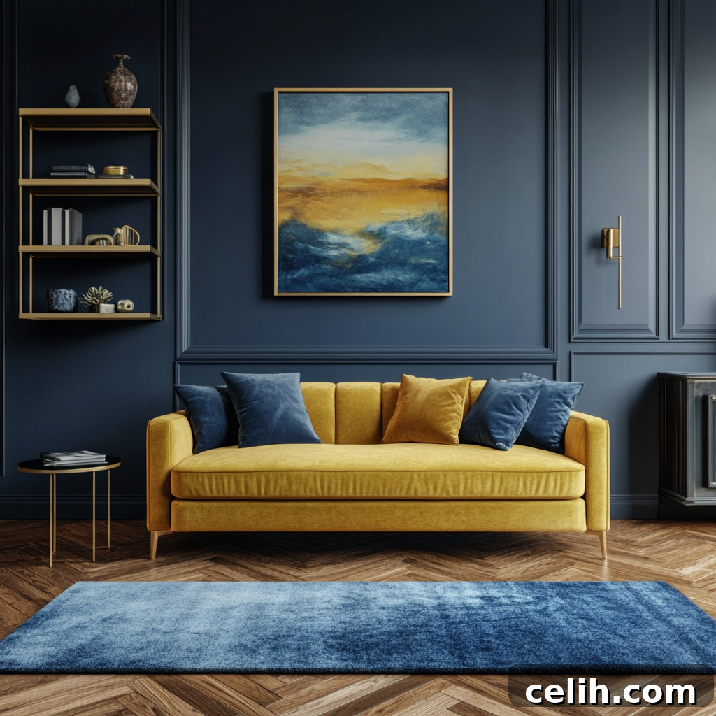
Conversely, darker shades, including deep charcoals, rich navy blues, sophisticated emerald greens, or even moody plums, possess the power to create a sense of intimacy and warmth. While often feared in smaller spaces, they can be strategically employed to provide a dramatic and luxurious ambiance in larger rooms, making them feel more inviting and less cavernous. In a generously sized living area, a dark accent wall can draw the eye and define a focal point, imbuing the space with a sophisticated and comforting embrace. The key is balance and consideration of natural light sources.
The interplay between natural light, artificial illumination, and colour can dramatically affect how a room feels at different times of the day. Rooms blessed with abundant natural light can become havens of warmth and vibrancy when layered with subtle, bright hues that enhance the light’s natural glow. Conversely, rooms with limited natural light, such as north-facing rooms or those with small windows, may benefit from softer, deeper colours that add depth and drama without overwhelming the senses. In such cases, carefully chosen paint colours can compensate for the lack of light, preventing the room from feeling cold or stark. It’s also vital to test paint swatches in various lighting conditions throughout the day, as artificial light sources (warm yellow vs. cool white) can also significantly alter a colour’s appearance.
Strategic colour choices also ensure that even the most challenging architectural elements blend seamlessly into the overall design, or alternatively, are highlighted as intentional design features. For example, a dark entryway accentuated by lighter trim can make the transition between spaces both dramatic and inviting, drawing visitors in. Choosing complementary tones in adjacent rooms can enhance the overall layout, introducing a sense of flow and seamless connectivity that elevates the entire home’s aesthetic. The ceiling, often overlooked, can also be treated as a “fifth wall.” Painting it a lighter shade than the walls can lift the room, while a darker or coloured ceiling can create a jewel-box effect, adding unexpected depth and character.
Crafting Cohesion: Harmony and Flow in Your Home’s Color Palette
While bold statements and unique palettes can define individual rooms with distinctive character, the ultimate goal in a comprehensive home renovation is to achieve a sense of cohesion and harmonious flow across the entire dwelling. Just as a composer meticulously crafts a symphony, homeowners should view colour as an opportunity to create a unified and harmonious feel throughout their living spaces. The transitions between rooms and zones should be carefully considered, ensuring that colours flow naturally and complement each other, rather than creating abrupt or disjointed experiences.
Establishing unified themes, whether grounded in specific colour palettes, stylistic inspirations, or a desired mood, helps to forge a strong identity for the home. This doesn’t mean every room must be the same colour; rather, it implies a thoughtful connection between spaces. By using a consistent underlying neutral base, for example, and then introducing variations in accent colours or different shades of a primary hue, renovators can ensure that each room feels like a distinct yet interconnected chapter in a cohesive narrative, rather than a collection of disconnected scenes. This might involve using an analogous colour scheme, where colours next to each other on the colour wheel are chosen for adjacent rooms, creating a subtle, pleasing progression.
This sense of unity is what truly creates powerful visual storytelling throughout a home. Shifting from one room to the next becomes a curated journey, with each space retaining its own unique identity while contributing meaningfully to the larger picture of the home’s aesthetic. Carefully chosen hues can guide the eye effortlessly through these transitions, promoting a deep sense of belonging, comfort, and continuity. This flow is particularly important in open-plan living arrangements, where colour can subtly define different functional zones—a cozy reading nook, a vibrant dining area, or a serene living space—without the need for physical barriers. A well-orchestrated colour scheme can also significantly enhance a home’s perceived value and appeal to potential buyers, demonstrating thoughtful design and meticulous attention to detail.
Maintaining harmony also involves considering the ‘rule of three’ or the ’60-30-10 rule’ for balancing colours. This suggests using a dominant colour for 60% of the space (walls), a secondary colour for 30% (furniture, textiles), and an accent colour for 10% (decor, artwork). Applying this principle, even subtly across multiple rooms, can reinforce the overall cohesive feel. It’s about building a common thread that weaves through the entire home, creating a calming, intentional backdrop for daily life.
The Art of Personal Expression: Reflecting Your Unique Style Through Color
Beyond its functional and aesthetic properties, colour in home renovation serves as a deeply intimate reflection of personal taste and identity. It offers a powerful canvas upon which homeowners can express their personality, showcase their individuality, and narrate their unique story. Whether your inclination leans towards the timeless elegance of classic neutrals, the invigorating zest of vibrant hues, or the sophisticated allure of moody tones, your colour choices should transcend fleeting seasonal trends. Instead, they should authentically mirror the unique tastes, cherished memories, and aspirations of those who call the space home.
The process of selecting colours is an opportunity for self-discovery. It involves considering who will inhabit these spaces and what they truly cherish. Does a calming sanctuary appeal to you after a busy day, or do you crave an energetic environment that sparks creativity? Are there specific colours from your travels or experiences that evoke joy or comfort? These introspective questions guide the selection process, helping to pinpoint colours that genuinely inspire, comfort, and invigorate, ultimately creating spaces where individuals and families can thrive. With each hue chosen, renovators are tasked with the rewarding challenge of translating abstract ideas of style, comfort, and personal narrative into tangible reality.
Ultimately, choosing colours is a deeply personal, yet often shared, experience. While individual preferences are paramount, gathering input from family members can significantly enrich this process, transforming it into a collaborative journey. This ensures that the chosen colours not only reflect the aesthetic desires of one but also resonate with the collective dreams, needs, and personalities of all the house’s residents. Compromise and shared vision can lead to palettes that truly represent the household’s identity. For instance, a child’s room might incorporate their favorite whimsical colours, while communal areas reflect a broader family consensus.
The beauty of interior design with colour lies in its flexibility. While painting walls is a significant commitment, the base palette can be enhanced and adapted over time through accessories, textiles, and artwork. This allows for evolution in personal style without constant major renovations. Each colour decision adds a brushstroke to the expansive canvas of living, with every shade carrying the potential to absorb new stories, house cherished memories, and inspire future moments for those who dwell within its walls. It transforms a house into a home, imbued with character and soul.
Conclusion
Harnessing the transformative power of colour is undeniably an integral and pivotal part of any successful home renovation. From subtly influencing our emotions and perceptions of space to creating a harmonious flow throughout a dwelling and serving as a profound expression of personal style, colour is far more than just paint on a wall; it is the very soul of interior design. While the myriad of colour decisions may initially seem daunting, the potential payoff in crafting inviting, expressive, and cohesive spaces that truly resonate with their inhabitants is immense and deeply rewarding.
As renovators embark on this creative venture, armed with an understanding of colour psychology, spatial dynamics, and the principles of harmony, they gain the power to shape not just the appearance, but the very heart and spirit of their home. Each thoughtful hue chosen, each deliberate stroke applied, contributes to an environment that fosters wellbeing, comfort, and inspiration. By making informed and intentional choices, homeowners can transform their living spaces into personalized sanctuaries, one vibrant, meaningful hue at a time, ultimately creating a home that looks stunning and feels unequivocally right.