
Embrace Tranquility: Modern Pastel Decor for a Calming Home
Pastels have long been associated with sweetness and youthful charm, but this year, it’s time to redefine their role in modern interior design. Far from being overly sugary or exclusively feminine, today’s pastel palettes are sophisticated, versatile, and profoundly calming. As the first gentle signs of spring emerge outdoors, inviting us to embrace new beginnings, there’s no better moment to infuse your home with these soft, inviting hues. Discover how careful application of pastels can create contemporary, grown-up, and stylish interior schemes that offer comfort and elegance for everyone.
The Evolution of Pastels: From Playful to Polished
The perception of pastels has evolved significantly. Gone are the days when they were confined to nurseries or overly whimsical spaces. Modern pastel decor embraces muted, dusty, and sophisticated shades that blend seamlessly into a variety of design aesthetics, from minimalist Scandinavian to classic contemporary. These softer tones provide a refreshing alternative to bold, saturated colors, offering a sense of peace and serenity that is increasingly sought after in our busy lives. Whether you’re looking to refresh a single room or overhaul your entire home, pastels provide a flexible and beautiful foundation.
For those seeking fresh inspiration on how to successfully integrate pastels into their personal sanctuary, leading furniture retailers like Furniture Village offer invaluable resources. Their latest lookbooks often feature innovative ideas for using pastels to maximum effect, particularly in central spaces like the living room. Their expert guidance highlights how even a touch of pastel can elevate a space, making it feel current and inviting.
The Perfect Partnership: Grey and Pastels
While pastels conjure images of light and delicate colors, the key to a truly sophisticated pastel scheme often lies in its foundation: grey. It might not be the first color that springs to mind when discussing pastels, but interior design experts universally agree that grey serves as an incredibly effective base color. Its neutrality and versatility make it the ideal canvas for adding subtle pops of pastel.
Why Grey Grounds Your Pastel Palette
- Neutral Foundation: Grey offers a stable and unobtrusive backdrop that prevents pastels from feeling overwhelming or childish. It allows the softer hues to shine without competing for attention.
- Modern Aesthetic: Pairing pastels with grey instantly elevates the look, giving it a contemporary and chic edge. This combination moves pastels into the realm of modern minimalism and sophisticated design.
- Versatility: Different shades of grey—from light dove grey to deep charcoal or a warm greige—can dramatically alter the mood. A lighter grey enhances the airiness of pastels, while a darker grey provides a dramatic contrast, making pastel accents stand out even more.
- Cohesion: Grey acts as a unifying element, tying together various pastel accents and ensuring a harmonious flow throughout the room.
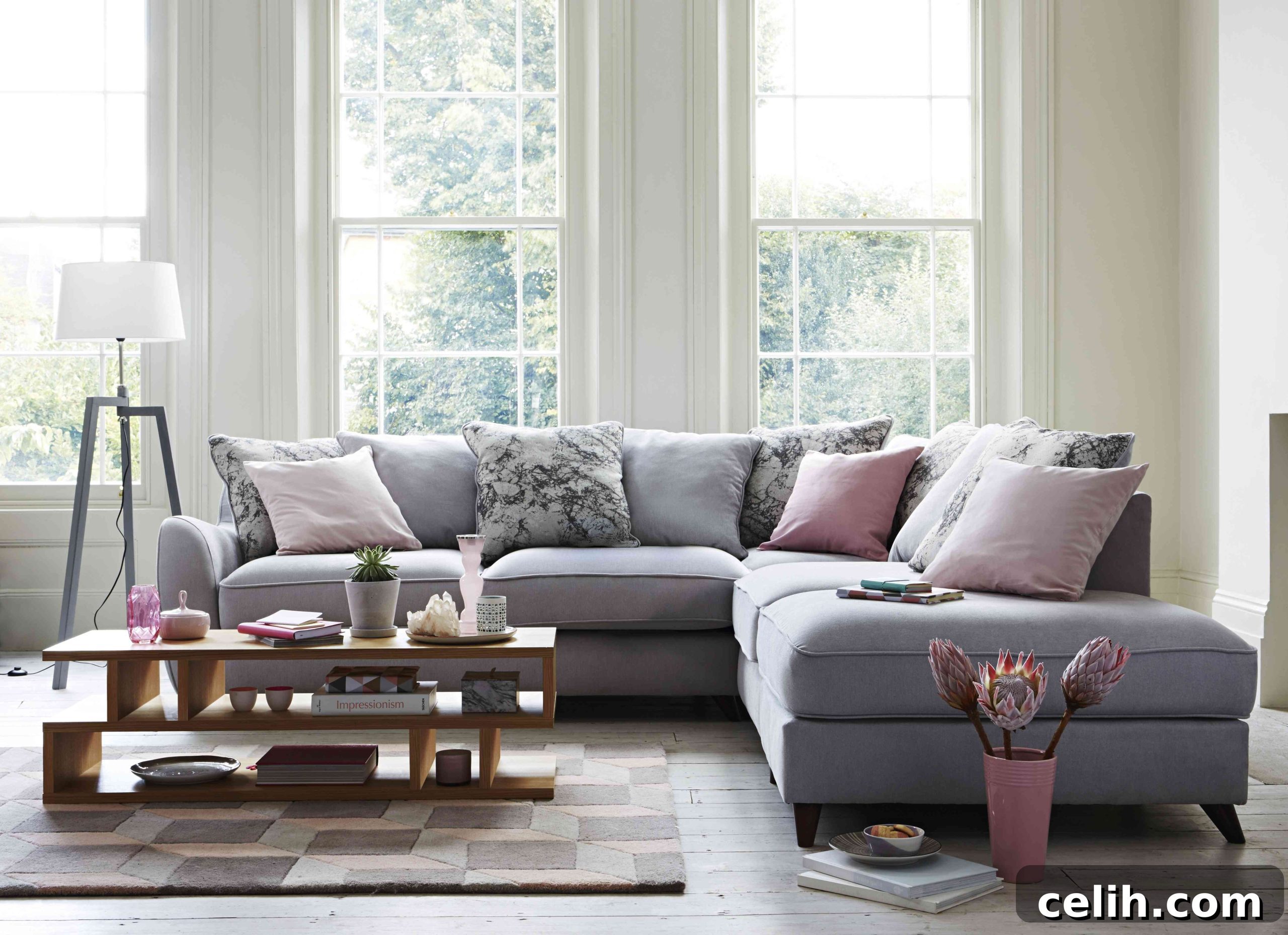
Consider a living room anchored by a large, muted grey corner sofa. This substantial piece of furniture provides a calming, solid base. Its inherent tranquility is then beautifully brought to life with carefully selected soft furnishings and accessories in pastel hues. Imagine plush cushions in dusky pink, pale blue, or soft mint green; elegant ornaments; or luxurious throws draped over the sofa. These small additions introduce color and personality without overwhelming the space, creating an inviting and cohesive atmosphere.
Crafting Cohesion: The Art of Accent Colors
To achieve a truly cohesive and calming interior, a crucial design principle is restraint. When working with accent colors, it’s generally best to stick to just one or two additional hues. This focused approach ensures that your room feels thoughtfully designed and serene, rather than cluttered or busy. Each chosen accent color, whether it’s a soft pink, a serene blue, or a gentle sage, should complement your primary grey base, creating a balanced and visually appealing environment.
Pantone’s Enduring Influence: Rose Quartz and Serenity
The selection of Pantone’s Rose Quartz (a soft, warm pink) and Serenity (a tranquil, cool blue) as the Colors of the Year in 2016 marked a significant moment for pastels in design. These choices highlighted a collective desire for comfort, security, and tranquility, resonating deeply with current lifestyles. Their enduring popularity means there’s an abundant supply of soft furnishings and home accessories available in these beautiful shades, making them perfect for creating a sophisticated pastel pop scheme.
Both Rose Quartz and Serenity are inherently cool and calming, promoting a sense of ease and relaxation. When combined with a soft grey, their individual qualities are enhanced. Rose Quartz brings a gentle warmth, while Serenity introduces a soothing coolness. This harmonious blend is ideal for a living room scheme where the primary goal is to foster a sense of peace and comfort. These colors also work wonderfully on walls; a lighter shade of grey paint or a subtle grey wallpaper can serve as an excellent backdrop, allowing the pastel accents to truly pop.
Adding Depth and Interest: Textures, Patterns, and Furniture
Your accent pieces don’t have to be uniformly plain. In fact, mixing things up by incorporating patterned items adds another layer of visual interest and personality to your space. Imagine cushions adorned with funky geometric prints or subtle abstract designs. These patterns provide a dynamic contrast against the smooth, soft edges of a sofa and plain cushions, preventing the room from feeling flat.
Incorporating Geometric Designs and Natural Materials
Geometric designs remain incredibly popular in contemporary decor. Their crisp lines and defined shapes offer a striking contrast to the organic forms of plants and the soft textures of textiles. Look for a beautiful geometric rug to define your seating area, or introduce candle holders, artwork, or even furniture pieces with strong geometric elements. For example, a coffee table with clean, angular lines, such as the Conran Balance coffee table, can introduce a refreshing juxtaposition of shapes. Its natural wood tones, when combined with dusky pink accents, create a sophisticated and inviting aesthetic.
Beyond its striking design, a well-chosen coffee table can also offer practical benefits. The Conran Balance design, with its multitude of shelves and compartments, provides ample space to display coordinating home accessories—perhaps a stack of art books, a delicate pastel-hued vase, or a sculptural object. It also keeps essential items like reading material and TV controllers neatly organized and easily accessible, blending functionality with exquisite style.
Beyond Color: The Power of Texture
To truly enhance your pastel scheme, don’t overlook the importance of texture. Introducing a variety of textures adds richness and depth, making the space feel more luxurious and inviting. Consider:
- Soft Furnishings: Velvet cushions for a touch of glamour, chunky knit throws for cozy warmth, or linen blend curtains for a relaxed elegance.
- Rugs: A high-pile rug for softness underfoot, or a flat-weave rug with a subtle pattern for added visual interest.
- Furniture Materials: Natural wood elements (like the coffee table), sleek metal accents in lamps or decorative objects, and perhaps even a hint of marble or glass for a touch of refinement.
- Wall Coverings: Wallpaper with a subtle tactile pattern, or even a textured paint finish.
Expanding the Pastel Palette: Beyond Pink and Blue
While Rose Quartz and Serenity offer a fantastic starting point, the world of pastels extends far beyond just pinks and blues. Exploring other soft hues can open up a spectrum of possibilities for your home:
- Mint Green: Fresh and invigorating, perfect for creating a tranquil oasis, especially when paired with natural wood and white.
- Lavender: Evokes a sense of calm and romance, beautiful in bedrooms or spaces where relaxation is key.
- Soft Yellow: A cheerful yet gentle color that can brighten any room, adding warmth without being overpowering.
- Peach/Coral: Brings a subtle vibrancy and warmth, especially lovely in sunlit rooms or combined with metallic accents.
The key is to select pastel shades that harmonize with each other and with your chosen neutral base, ensuring a coherent and pleasing aesthetic.
Pastels Throughout Your Home: Versatility Unveiled
The beauty of the grey and pastel color scheme lies in its incredible versatility. While it creates a stunning living room, its calming and sophisticated nature makes it suitable for almost any room in the house.
A Serene Bedroom Retreat
Imagine a bedroom transformed into a serene sanctuary. Soft grey bedding provides a restful foundation, while pastel pops come alive through decorative pillows, a plush throw, or even an accent wall in a calming pastel shade. This scheme works wonderfully for creating a truly tranquil sleep environment. Furthermore, this approach can be an excellent compromise for those who find overtly feminine decor challenging. The balance of masculine grey with soft, subtle pastels offers an appealing aesthetic that suits diverse tastes, providing gentle, sophisticated touches without being overly “girly.”
Inviting Dining Spaces
In the dining room, pastels can add an air of understated elegance. Think pastel-hued chair cushions, a minimalist floral centerpiece in soft tones, or delicate tableware that introduces subtle color. This creates an inviting atmosphere for meals and gatherings, promoting a relaxed and comfortable dining experience.
Productive Home Offices
Even a home office can benefit from the calming influence of pastels. Incorporate pastel stationery, storage boxes, or a piece of wall art to add visual interest without creating distraction. The gentle colors can foster a more focused and peaceful working environment.
Practical Tips for Integrating Pastels
Ready to embrace the modern pastel trend? Here are some practical tips to help you get started:
- Start Small: Begin by introducing pastel accessories like cushions, throws, or decorative objects. This allows you to experiment without a major commitment.
- Balance with Neutrals: Always remember the power of grey (or white, beige, cream) as a grounding color. It prevents pastels from becoming overwhelming.
- Consider Natural Light: Pastels can look different under various lighting conditions. Observe how colors appear in your room throughout the day before making final decisions.
- Mix Textures: As discussed, combining different textures (smooth, rough, soft, hard) adds depth and sophistication to your pastel scheme.
- Don’t Be Afraid to Experiment: Interior design is personal. Play around with different shades and combinations until you find what truly resonates with you.
Conclusion: A Fresh Perspective on Pastels
If you’re contemplating a color change in your living room or any other space this year, we wholeheartedly recommend exploring the sophisticated options available with grey and pastels. A few key pieces of furniture in a calming grey, such as a stylish sofa and an accompanying accent chair, coupled with strategically placed pastel pops, can utterly transform a room. This approach breathes fresh life into your home, imbuing it with a serene and contemporary feel that’s perfect for spring and beyond.
The understated elegance and calming effect of this color scheme make it a fantastic choice for those who might have previously shied away from softer hues. It’s a chic, modern way to re-embrace color and create an inviting, harmonious home environment that you’ll love living in.
What do you think – could this sophisticated, calming color scheme find a place in your home?
(Disclosure: This is a collaborative post)