
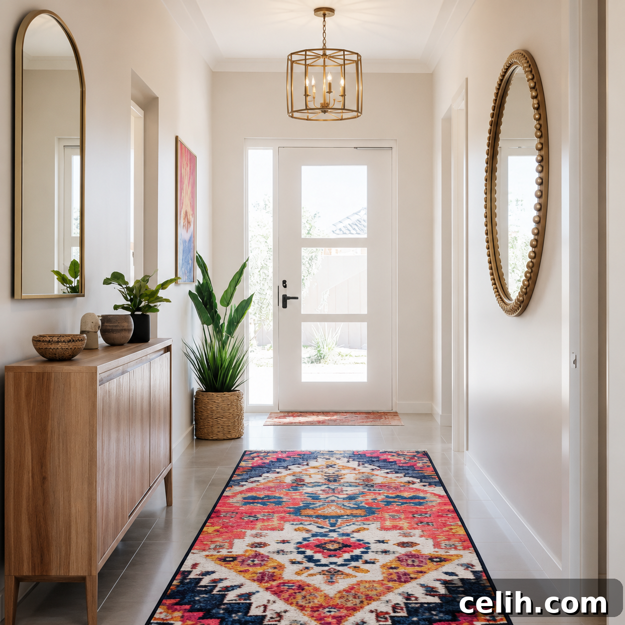
Your hallway endures more foot traffic, poorer natural light, and closer scrutiny than nearly any other space in your home.
Yet many people treat it as an afterthought, grabbing a neutral off the shelf without considering how shadows, narrow walls, and artificial lighting change colour. A shade that feels serene in a living room can turn muddy in a hallway. The wrong tone makes your whole home feel cramped and unwelcoming the moment someone steps inside.
Hallways call for a smarter approach. The best paint colours for hallways must handle low light, disguise scuffs, make tight spaces feel open, and transition smoothly between rooms. It’s a bigger challenge than it first appears.
This guide explains the colours that perform well in real hallway conditions and how to choose the right one for your layout and light.
Why Hallway Paint Colour Matters More Than You Think
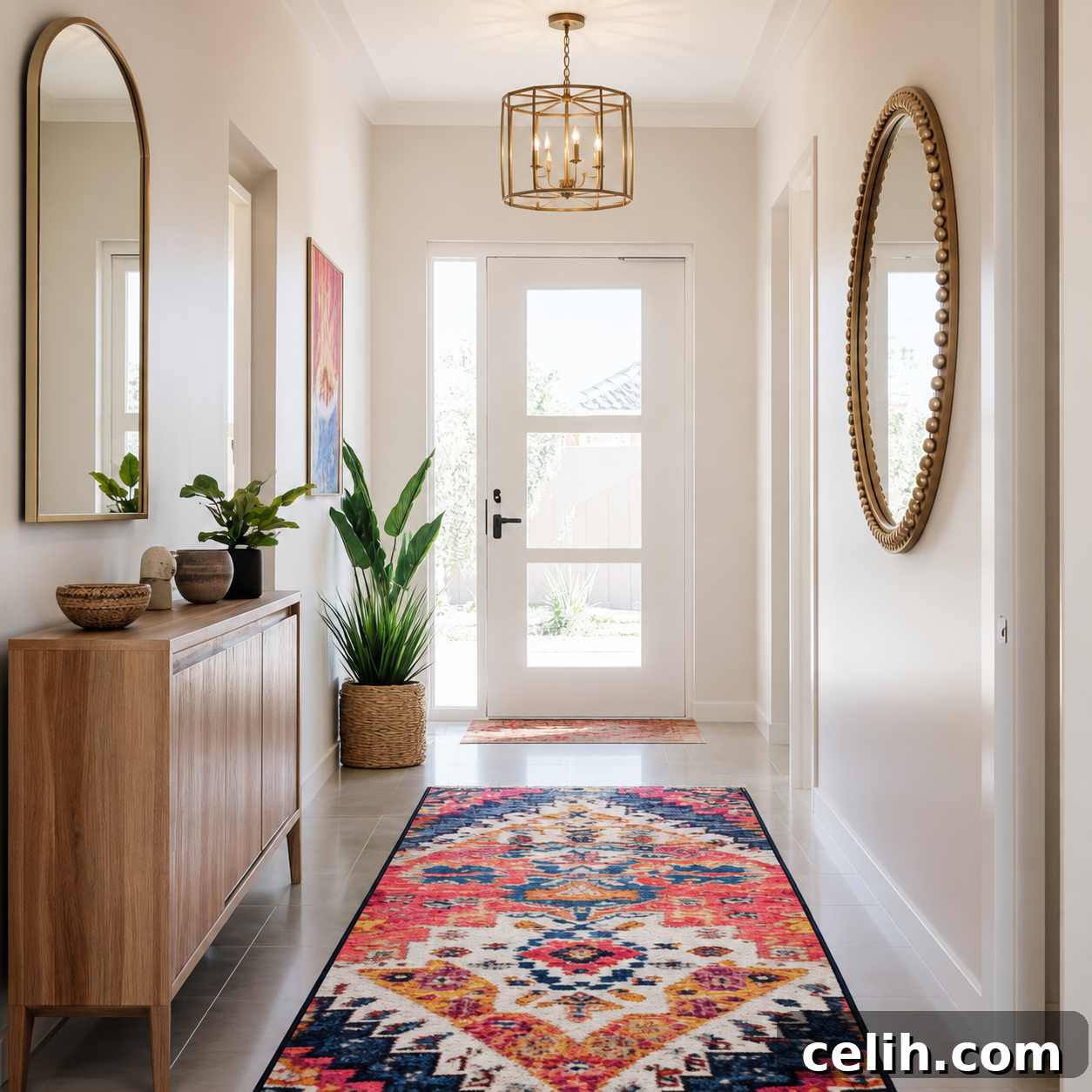
Hallways are high-traffic connectors that are seen constantly but rarely benefit from direct sunlight. They’re where first impressions form when guests arrive. A poorly chosen colour can absorb the limited light, emphasize narrow proportions, and show every scuff and handprint within weeks. Conversely, the right shade opens up tight spaces, bounces light, and visually ties your home together.
Hallways are usually long, narrow, and interrupted by doors, with few or no windows. That means you rely on artificial light, which shifts how colours read. A beige that looks warm in sunlight can appear gray under LED bulbs. A bright white that works in a bedroom may glare harshly in a narrow hallway. Understanding your hallway’s lighting and dimensions is the difference between a space that feels intentional and one that feels like a mistake.
Hallway Paint Colour Cheat Sheet
Short on time? Use this quick guide to narrow your colour family before exploring detailed options.
| If your hallway is… | Consider these colours | Best finish |
|---|---|---|
| Dark with little natural light | Warm white, cream, soft greige | Durable matt or eggshell |
| Narrow and enclosed | Warm white, pale sage, soft blue | Durable matt |
| Busy family hallway | Mid-tone greige, warm taupe, soft stone | Eggshell or washable matt |
| Modern home | Greige, warm grey, muted white | Durable matt |
| Traditional home | Cream, linen, soft stone | Eggshell |
| Hallway with oak flooring | Warm white, beige, greige, sage | Eggshell |
| Hallway with grey flooring | Warm greige, mushroom, soft white | Durable matt |
No single paint works in every home. Natural light, flooring, adjoining rooms and lighting type all influence how a colour appears on a wall.
How Hallway Orientation Changes Paint Colours
The direction your hallway faces affects how colours appear throughout the day.
North-facing hallways
North-facing hallways often receive cool, weak light. Colours can read flatter and cooler, so choose warmer whites, creamy neutrals, mushrooms and warm greiges for a more welcoming result.
South-facing hallways
South-facing hallways get bright, warm daylight for much of the day. Most neutrals perform well; cooler greys or crisp whites can balance the warmth if you prefer a fresher look.
East-facing hallways
Morning light brings warmth, while afternoons cool. Mid-tone greiges, soft greens and balanced warm whites remain steady throughout the day.
West-facing hallways
West-facing hallways are muted in the morning and warmer later in the day. Soft taupes, gentle stone colours and warm neutrals adapt well to these changes.
Understanding Undertones
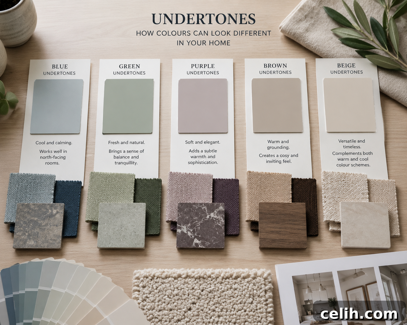
Paint colours rarely match their sample cards exactly. Neutrals often contain undertones—blue, green, purple, brown, yellow or pink—that become more obvious in hallways with limited natural light. These hidden hues can change the mood once they cover several walls.
As a general guide:
- Blue undertones create a cooler, contemporary appearance but may feel cold in dark hallways.
- Green undertones feel calm and natural, pairing well with timber flooring.
- Purple undertones can become noticeable under artificial light and are usually best avoided in enclosed spaces.
- Brown or beige undertones add warmth and are forgiving for family homes.
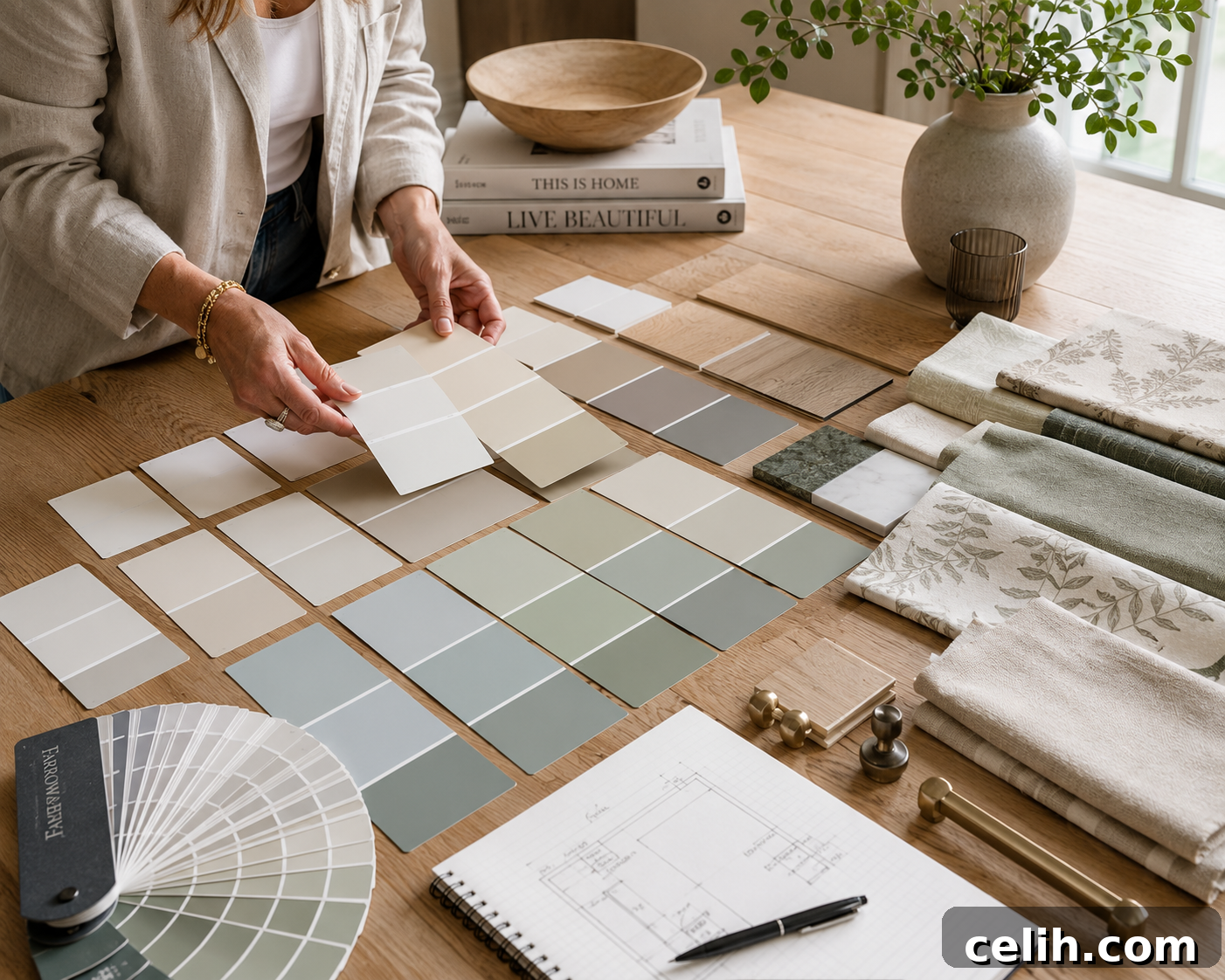
Compare several similar samples side by side. Small differences that seem insignificant in the shop become obvious once paint covers actual walls.
What is Light Reflectance Value (LRV)?
Light Reflectance Value (LRV) measures how much light a colour reflects, from 0 (black) to 100 (pure white). In hallways, LRV helps predict brightness under limited daylight.
- High LRV (75–90): reflects the most light and brightens dark hallways.
- Medium LRV (50–75): provides warmth while keeping the space reasonably bright.
- Low LRV (below 50): creates a moodier look but can make a narrow hallway feel more enclosed.
LRV is a useful comparison tool but shouldn’t be the only factor when choosing paint.
Warm Whites That Actually Feel Warm
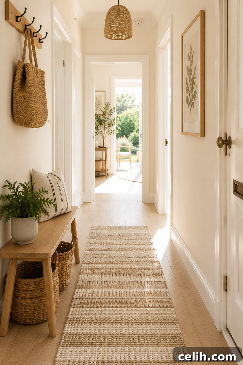
Pure white often backfires in hallways: it amplifies shadows, glares under artificial light, and can feel sterile. A warm white with slight depth feels inviting without reading as creamy or beige.
Reliable warm whites reflect maximum light while softening starkness. They work especially well with warm wood floors and prevent a cold, basement-like feeling in windowless hallways. Test samples at different times and under your LED bulbs, since some warm whites can skew yellow under certain lighting.
Greige: The Chameleon Colour for Tricky Hallways
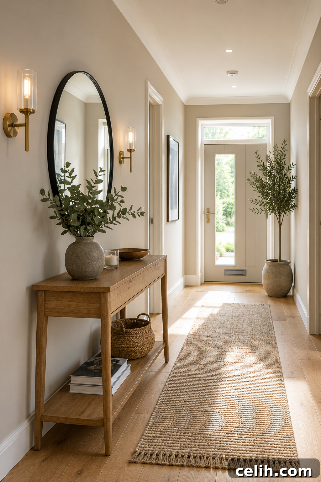
Greige balances gray and beige, adapting to lighting instead of fighting it. It hides imperfections better than pure white and transitions smoothly between rooms with different palettes. Popular greiges handle low light well, but remember that greiges vary—test samples on your actual wall and observe them over 24 hours.
Soft Greys That Don’t Turn Blue or Purple
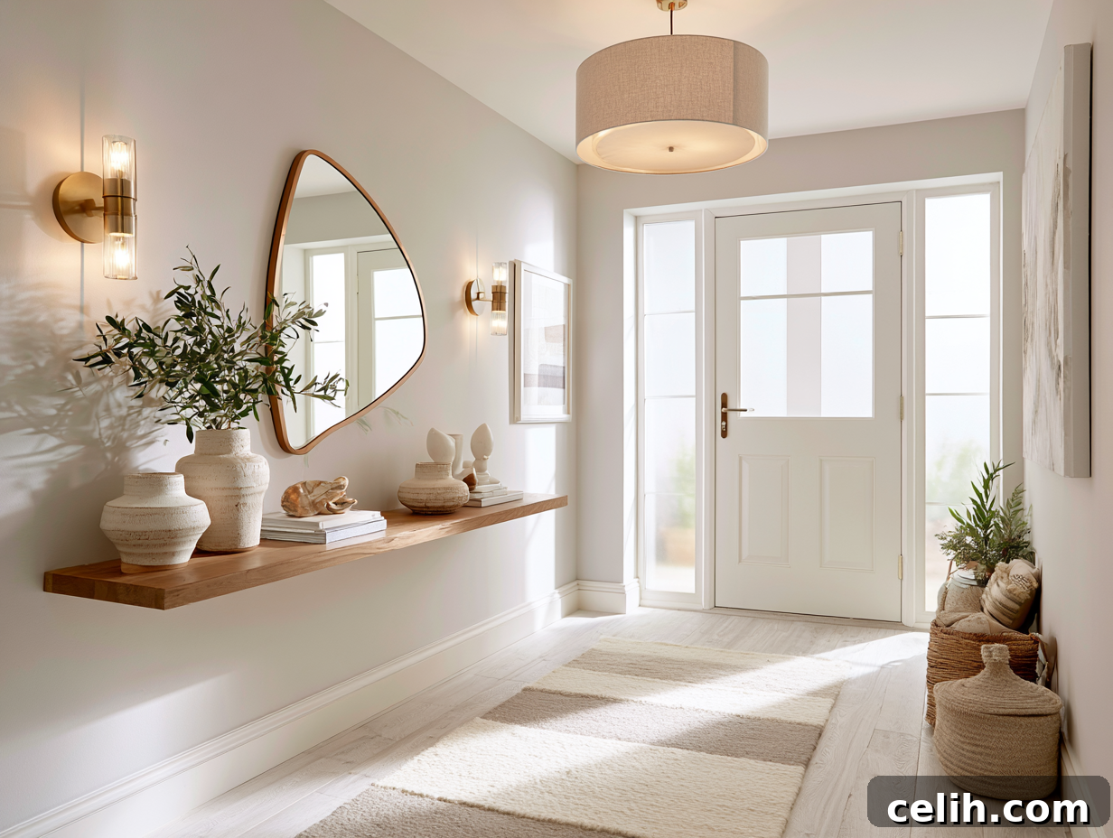
Grey is popular, but many greys have undertones that reveal themselves in low light. Cool greys with blue or purple undertones can make hallways feel cold and muddy. Opt for warm or true greys with minimal undertones and match your bulb temperature—warm LED bulbs help warm greys read accurately.
Soft Blues and Greens That Expand Small Spaces
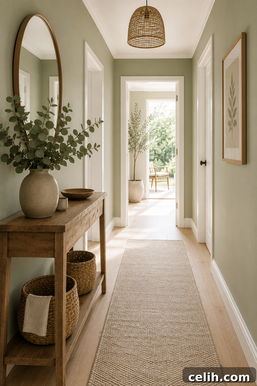
Soft blues and greens can visually recede, creating the illusion of depth and openness. Pale blues and soft greens work best lightly saturated and with some borrowed natural light. They also conceal scuffs better than pure whites and light greys.
Warm Neutrals That Handle Artificial Light Like Pros
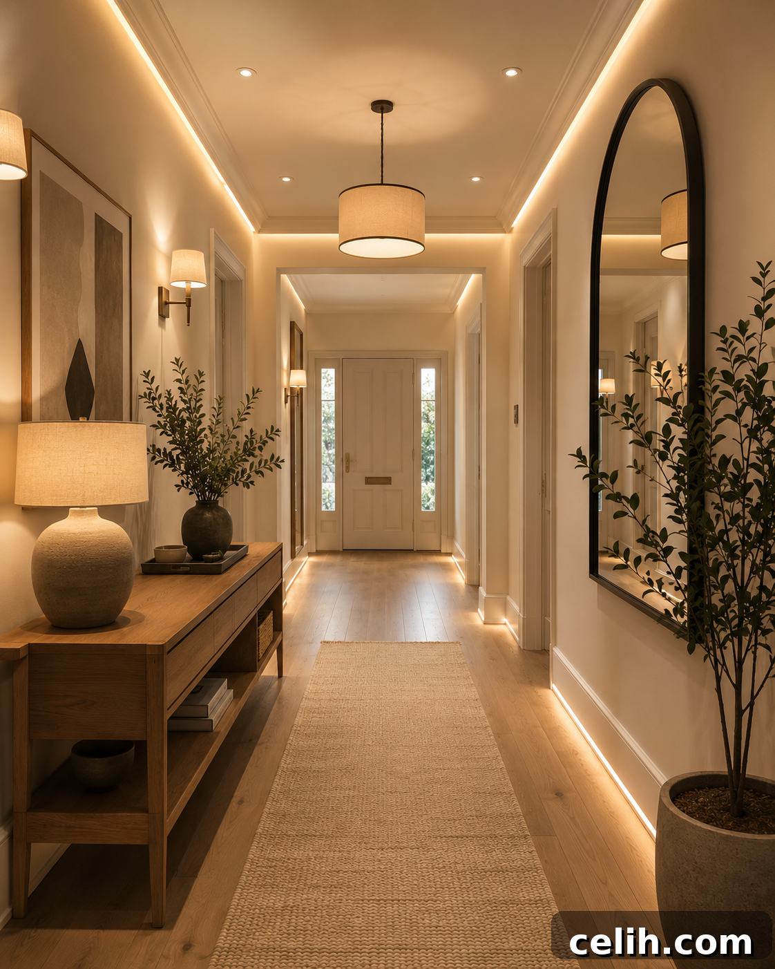
If your hallway depends on artificial light, warm neutrals are a safe choice. Soft tans, warm taupes and creamy beiges reflect artificial light without glaring or turning muddy. They make hallways feel intentional and cohesive, especially when connecting rooms with varying schemes. To avoid a bland result, add interest with trim, artwork or lighting fixtures.
Choosing Paint Colours to Complement Your Flooring
Flooring occupies much of the visual field, so your wall colour should complement it rather than compete.
Light oak flooring
Warm whites, soft greiges, pale sage greens and creamy neutrals enhance oak’s warmth without overwhelming it.
Dark wood flooring
Dark woods suit lighter wall colours for contrast—warm whites, soft stone shades and gentle greiges keep balance.
Grey wood or laminate flooring
Grey flooring pairs well with warmer wall colours—mushroom tones, warm greiges and creamy whites soften the look.
Natural stone or slate
Stone floors work beautifully with earthy walls such as taupe, olive green, muted clay and warm off-whites.
Always compare paint samples against your actual flooring to ensure the undertones work together.
Complete Hallway Colour Palette Ideas
Think in whole schemes rather than picking a single wall colour.
Warm Contemporary
- Walls: Accessible Beige
- Trim: Soft warm white
- Flooring: Natural oak
- Furniture: Slim oak console
- Accessories: Black-framed mirror, woven runner, plant
Calm Coastal
- Walls: Pale sea blue
- Trim: Crisp white
- Flooring: Pale timber
- Accessories: Linen runner, woven baskets, brass lighting
Modern Minimalist
- Walls: Neutral greige
- Trim: Matching wall colour
- Flooring: Pale oak
- Accessories: Black metal lighting, simple mirror
Treating your hall as a complete design scheme produces a more cohesive, professional result.
Off-Whites and Creams for Traditional Homes
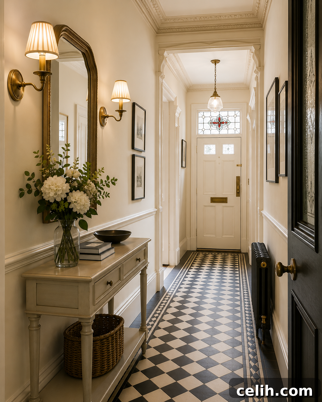
Traditional architecture often benefits from off-whites and creams, which complement crown molding, wainscoting and classic trim. These shades brighten spaces without clashing with antique finishes or warm wood tones. Pair off-whites with slightly lighter trim for a subtle, intentional contrast, or match trim to the walls for a monochromatic effect.
Colour Drenching: A Modern Way to Transform a Hallway
Colour drenching—painting walls, ceiling and woodwork the same shade—reduces visual interruptions and often makes narrow spaces feel larger. Warm greiges, muted greens, mushrooms and soft taupes work particularly well. If a full drench feels too bold, use the same shade with different finishes (durable matt on walls, eggshell on woodwork) to maintain cohesion with subtle contrast.
Hallway Colour Trends
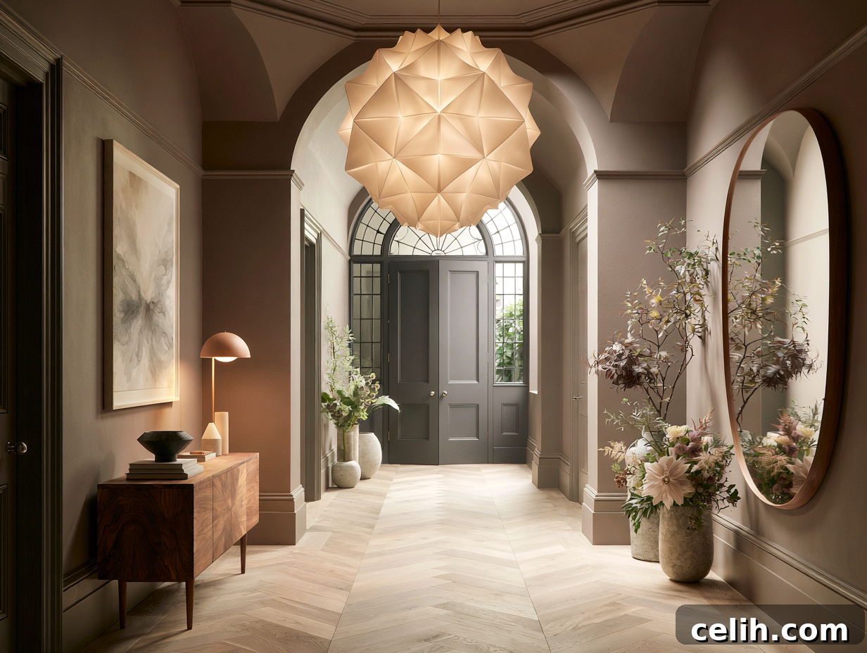
Timeless neutrals remain practical, but current hallway trends lean toward warmer, softer tones: warm mushroom, muted olive greens, soft clay and stone-inspired neutrals. The trend is moving away from brilliant white toward warmer neutrals that feel inviting while staying light.
How to Test Paint Colours in Your Actual Hallway
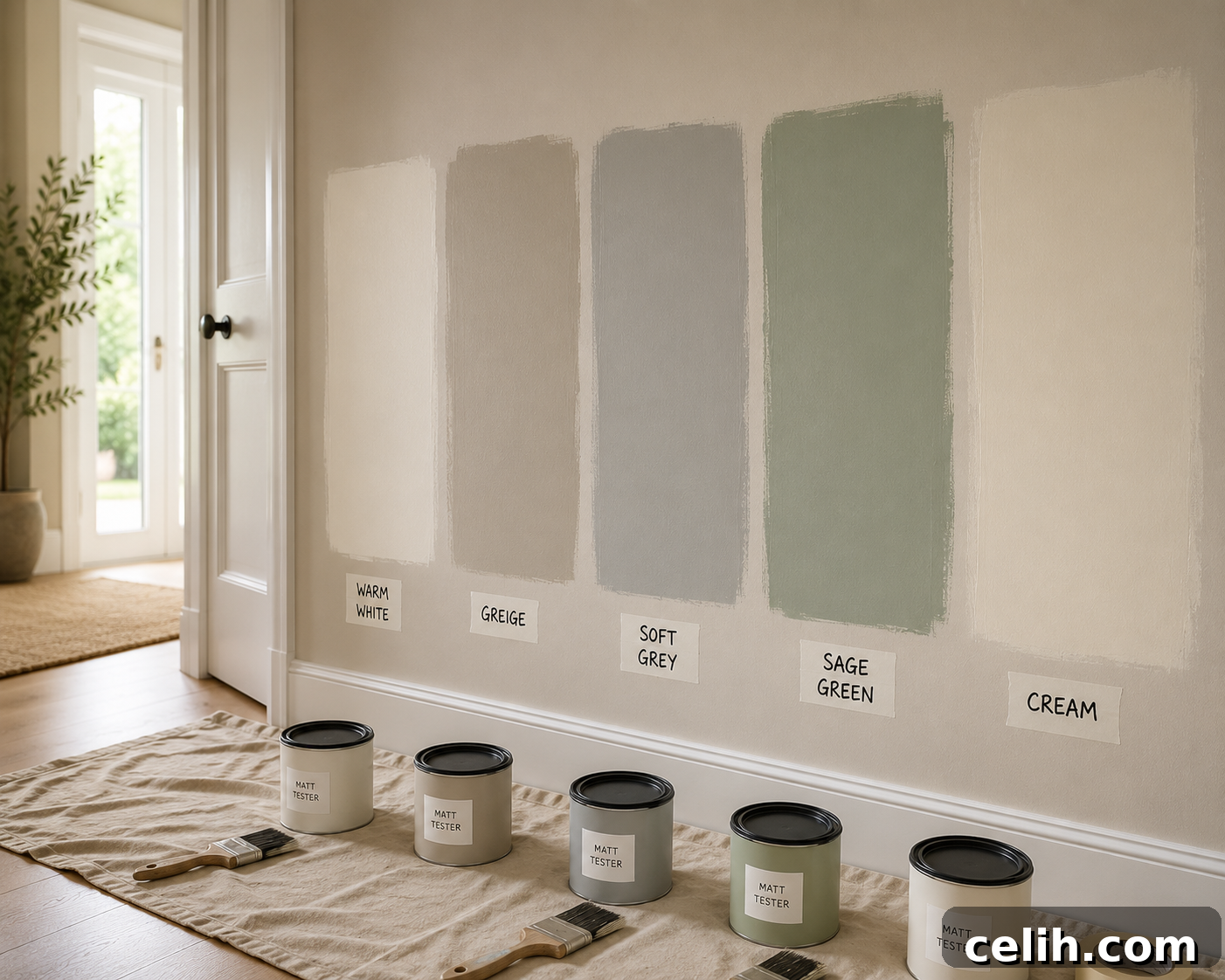
Store chips won’t tell you how a colour will perform in your hallway. Test samples in the actual space under your real lighting at different times of day.
Recommended process:
- Buy sample pots of 3–5 top colours.
- Paint large swatches (at least 2ft x 2ft) directly on your hallway walls.
- Observe samples in the morning, afternoon and evening with your artificial lights.
- View from different angles and from adjoining rooms.
- Live with samples for 48 hours before deciding.
Testing eliminates guesswork and regret. Pay close attention to how colours look next to doorways and where the hallway opens into other rooms.
Avoiding the Biggest Hallway Paint Mistakes
Common mistakes and how to avoid them:
- Relying on tiny chips: Always test large swatches on the actual wall.
- Ignoring bulb temperature: Match paint undertones to your lighting.
- Using flat paint in high traffic areas: Choose eggshell or satin for washability.
- Skipping primer over dark colours: Use a quality primer to avoid extra coats.
- Skipping the second coat: Budget time for two full coats for even coverage.
- Choosing colours that clash with flooring: Compare samples against your floor before deciding.
With planning and quality materials, your hallway will look professionally finished rather than hastily done.
Frequently Asked Questions
What is the best paint colour for a narrow hallway?
Warm whites, soft greiges and pale sage greens reflect light well and help walls feel less enclosed.
Should hallways be lighter than adjoining rooms?
Not necessarily. Many designers choose hallway colours that complement neighbouring rooms rather than matching them exactly.
Which colours hide marks and scuffs best?
Mid-tone greiges, taupes, soft greens and stone colours are more forgiving than brilliant whites.
What paint finish is best for hallways?
Durable matt or eggshell finishes offer good durability and cleanability for busy homes.
Should ceilings always be painted white?
White ceilings are classic, but painting ceilings the same colour as the walls can create a softer, contemporary look in small hallways.
Can you use dark colours in a hallway?
Yes—dark greens, deep blues and charcoals can be stunning in larger hallways or well-lit spaces, especially with lighter flooring and well-placed mirrors.
Final Thoughts
The best hallway paint colour isn’t simply what’s trending or what looked good on a tiny paint chip. It’s the shade that works with your home’s light, complements your flooring, suits your décor and withstands the demands of a busy space.
Whether you choose a warm white to brighten a dark entrance, a versatile greige that connects rooms, or a subtle sage that adds character, understanding undertones, lighting and finish makes all the difference. Test samples, view them at various times of day, and see how they work with your flooring, doors and furnishings before committing.
Paint is only one element of a welcoming hallway—lighting, mirrors, artwork, runners and storage furniture all play a role. A well-designed hallway sets the tone for your home. Choose a colour that reflects light, complements your home’s character and makes you smile every time you walk through the door.