
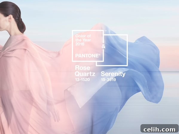
Embracing Harmony: Pantone’s Revolutionary Dual Colors of the Year, Rose Quartz & Serenity (2016)
The annual announcement from Pantone regarding its coveted Color of the Year is always a pivotal moment in the design world, influencing everything from fashion runways to product packaging and, most notably, interior design. For 2016, however, Pantone delivered an unprecedented and delightful surprise: not one, but two captivating shades were chosen to collectively represent the mood and design trends of the year. Breaking from tradition, Pantone introduced the harmonious blend of warm Rose Quartz and cool Serenity, ushering in a new era of tranquility and balance.
This groundbreaking decision to feature a duo rather than a single hue immediately captured global attention. Far from being merely “plain old pink and blue”—colors often casually associated with children’s nurseries—Rose Quartz and Serenity carry a profound significance. Pantone’s thoughtful selection speaks volumes about a collective yearning for calm, connection, and a refuge from the increasing stresses of modern life. It marks a deliberate shift towards colors that psychologically fulfill our desire for reassurance and security, offering a gentle antidote to the complexities of our contemporary world.
The Deeper Meaning Behind the Dual Choice
In a world often characterized by rapid change and digital saturation, the psychological comfort offered by Rose Quartz and Serenity is more relevant than ever. Pantone’s rationale highlighted a growing societal desire for mindfulness and well-being. The selection of these particular pastel hues serves as a symbolic embrace of comfort and relaxation, encouraging moments of respite and reflection. Unlike the rich, earthy Marsala that characterized 2015, these softer tones represent a departure, signaling a shift towards a gentler, more ethereal aesthetic.
The synergy between Rose Quartz and Serenity is truly enchanting. Rose Quartz, a persuasive yet gentle tone, conveys compassion and a sense of composure. It’s a comforting, soft pink that exudes warmth and tenderness, inviting feelings of connection and approachability. Serenity, on the other hand, is weightless and airy, like the expanse of the blue sky above us. It brings feelings of relaxation, tranquility, and a refreshing sense of calm. When these two colors blend, they create a mesmerizing gradient reminiscent of a serene sunset or sunrise, where the horizon meets the sky in a peaceful embrace. This natural blending evokes the beauty of hydrangeas, with their delicate pink, blue, and lilac petals, showcasing nature’s innate artistry in color combination.
Understanding Rose Quartz: The Embrace of Warmth and Compassion
Rose Quartz is more than just a pink; it’s a nurturing and inviting hue that symbolizes reassurance and compassion. Its soft, warm undertones are intrinsically linked to feelings of comfort, making it an excellent choice for creating spaces that feel safe and welcoming. In interior design, Rose Quartz can transform a room into a serene sanctuary. Imagine a living room adorned with Rose Quartz throw pillows, a cozy blanket, or even an accent wall that radiates gentle warmth. It pairs beautifully with neutral palettes like creams, greys, and whites, adding a touch of sophisticated softness without being overtly feminine. For those looking to introduce subtle color, kitchenware, bedding, or bathroom accessories in Rose Quartz can instantly elevate the mood of a space, imbuing it with a sense of calm elegance.
Exploring Serenity: The Essence of Tranquility and Peace
Serenity, a light and airy blue, offers a soothing contrast to the warmth of Rose Quartz. It represents a connection to the vastness of the sky and the calming influence of open spaces, promoting feelings of peace, order, and relaxation. This gentle blue encourages introspection and clarity, making it ideal for environments where focus and tranquility are desired. In home decor, Serenity can be used to create an atmosphere of peaceful escape. Think of a bedroom with Serenity-colored walls, evoking the feeling of sleeping under a clear sky. It works wonderfully in bathrooms, creating a spa-like ambiance, or in home offices, promoting a sense of calm concentration. Serenity also complements natural wood tones, crisp whites, and metallic accents like silver or chrome, adding a contemporary yet timeless appeal.
The Harmonious Blend: Integrating Rose Quartz and Serenity into Your Home
The true genius of Pantone’s 2016 selection lies in how beautifully Rose Quartz and Serenity complement each other. Together, they achieve a perfect balance between a warm embracing hug and a cool, calming breeze. This duality reflects a broader cultural conversation about gender fluidity and equality, challenging traditional color associations and opening up new possibilities for expression in design. The blend creates a sense of equilibrium, inviting both feminine and masculine energies to coexist harmoniously within a space.
When incorporating these two colors into your home, consider their versatility. They can be used in equal measure, perhaps through color blocking or a gradient effect on walls or textiles, creating a soft, dreamlike transition. Alternatively, one color can serve as a dominant backdrop, with the other introduced as an accent. For example, a room with soft Serenity walls could feature Rose Quartz cushions, artwork, or decorative objects. The key is to leverage their inherent softness to create an inviting and peaceful atmosphere. These colors also pair wonderfully with other pastels, muted greens, soft yellows, and even deeper jewel tones for a touch of dramatic contrast. Metallics, especially rose gold, silver, and matte brass, can add a sophisticated shimmer, while natural textures like wood, linen, and wool enhance their organic appeal.
These colors are surprisingly adaptable across various design aesthetics. They can imbue a minimalist Scandinavian space with warmth, soften the edges of an industrial loft, or bring a contemporary twist to a classic traditional setting. For bohemian interiors, their gentle nature allows them to blend seamlessly with natural fibers and eclectic patterns. Even in a nursery, where these colors might initially seem “obvious,” their sophisticated application through modern patterns and quality materials can elevate the space beyond the conventional, creating a truly serene and stylish environment for a child.
Beyond Interiors: The Influence of Rose Quartz and Serenity
While often highlighted in interior design, Pantone’s Colors of the Year extend their influence far beyond the home. In fashion, these hues graced runways, appearing in delicate fabrics and flowing silhouettes, offering a fresh, gentle alternative to bolder palettes. The beauty industry saw a surge in products featuring soft pinks and blues, from makeup to nail polish, promoting a natural and ethereal look. Even in graphic design and branding, companies adopted these tones to convey messages of compassion, trust, and innovation, reflecting a consumer base increasingly drawn to brands that embody mindful and empathetic values.
The enduring appeal of Rose Quartz and Serenity lies in their timeless quality and their ability to evoke a profound sense of calm and optimism. They invite us to slow down, find balance, and appreciate the gentle beauty that surrounds us. Their selection was a forward-thinking move by Pantone, acknowledging a global desire for comfort, security, and a more fluid approach to design and identity.
What are your thoughts on this revolutionary dual selection? Will you be bringing the calming embrace of Rose Quartz and the tranquil allure of Serenity into your home decorating projects?
Curated Inspiration: Homeware & Accessories in Rose Quartz and Serenity
To help inspire your next decor project, here’s a selection of homeware and accessories that beautifully embody the spirit of these two captivating colors. From art prints to luxurious textiles, discover how easily you can integrate Rose Quartz and Serenity into your living spaces, creating an environment that resonates with peace and style.
Stylish Picks for Your Home:
Top row, from left to right:
-
“You can’t use up creativity” art print – Milly’s Cottage: A motivational piece that adds a touch of artistic flair in soft hues.
-
Light pink faux fur cushion – H&M: Inject texture and the warmth of Rose Quartz into any seating arrangement.
-
Peony watercolour cushion – Soboleva Art on Etsy: A delicate artistic touch, combining floral elegance with the gentle palette.
Middle row, from left to right:
-
Bloomsbury sofa – Harveys: A statement furniture piece that can anchor a room in Serenity blue or Rose Quartz, offering supreme comfort and style.
-
Yankee Candle Pink Sands’ reed diffuser – Debenhams: Infuse your space with a calming aroma, subtly referencing the Rose Quartz aesthetic.
-
Pink ruched Arietta bed linen, Star by Julien Macdonald – Debenhams: Luxurious bedding in Rose Quartz for a serene and inviting bedroom oasis.
Bottom row, from left to right:
-
Blossom branch wall sticker – Oakdene Designs: A charming wall accent that brings natural elegance and a hint of the delicate pink hue.
-
Shoreditch denim rug – Designers Guild: A practical yet stylish addition, grounding your space with the calming essence of Serenity blue.
-
Decked out pink stone coasters, set of four – West Elm: Functional and chic, these coasters add a subtle pop of Rose Quartz to your living area.