
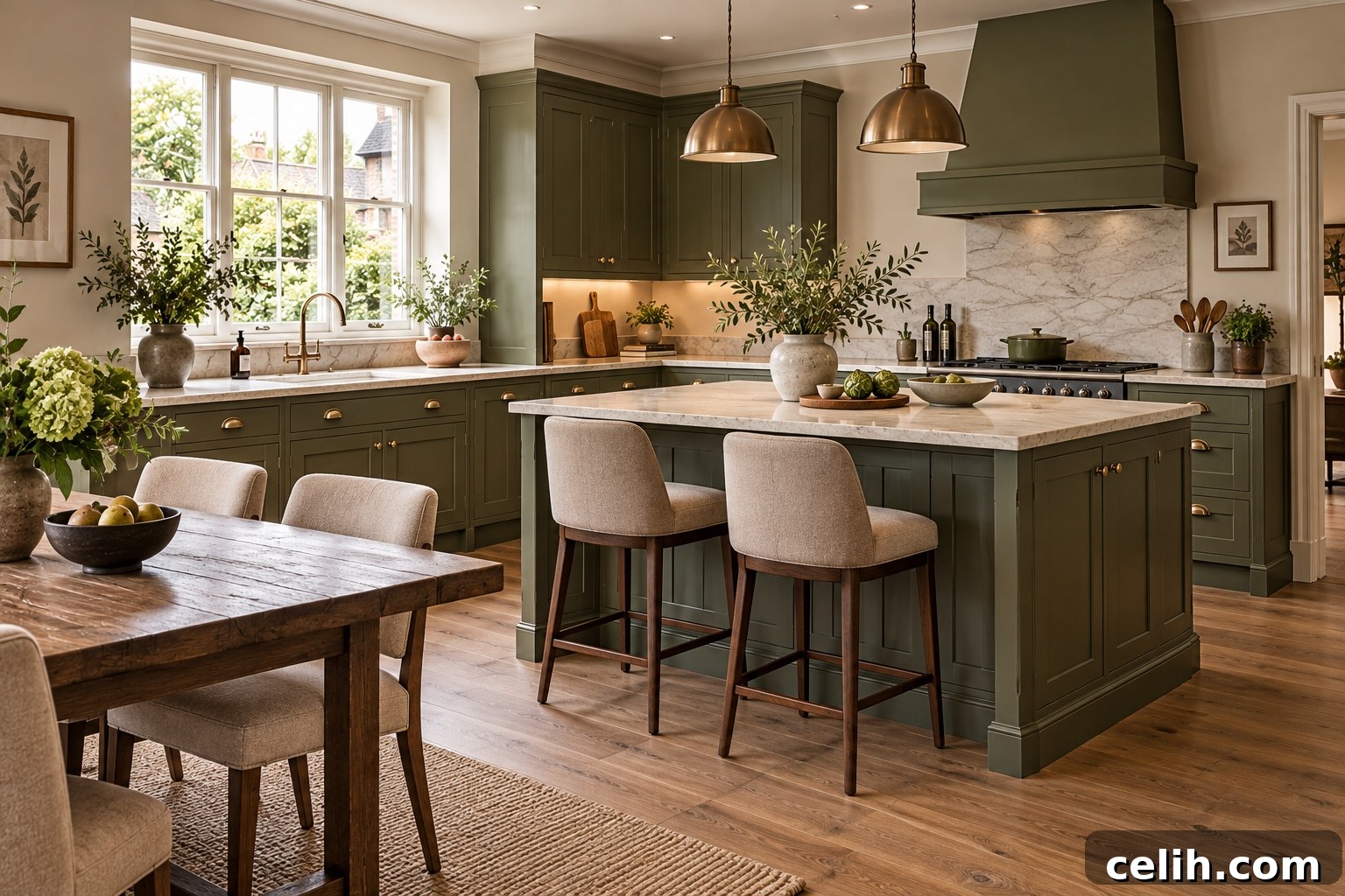
Interior colour trends rarely shift overnight. Instead, tones evolve slowly: a pink warms, a green deepens, and once-daring colours become calm backdrops. That gradual change is the defining story for 2027.
Early Colour of the Year announcements and industry forecasts reveal consistent themes: earthy pinks, natural greens, softened blues, oxblood and red-brown tones, clay and warmer neutrals. Together they form a complementary palette that makes colour feel more natural, warmer and easier to live with.
Quick Answer: What Colours Will Be Popular in 2027?
Key interior trends for 2027 include earthy pink, olive and moss greens, softened blue, burgundy and red-brown, and warm neutrals such as mushroom, cream, taupe and clay. Many of these colours carry muted, mineral or brown undertones, so they behave more like neutrals and layer well together.
Why Are Interior Colours Changing in 2027?
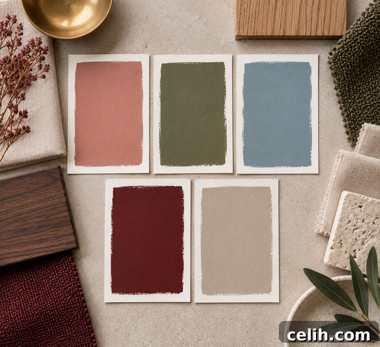
For years, white, grey or beige walls acted as neutral canvases while furniture and accessories provided colour. Now that boundary is blurring. Olive, muted blue, clay pink and red-brown can be used across whole rooms without feeling flashy. The trend favors colours with complexity—brown, grey, clay or mineral undertones that change subtly with light and context.
Forecasts from major paint brands present broad collections rather than single, rigid palettes. Their selections emphasize combinations built around craftsmanship, individuality, nostalgia and a renewed relationship with the natural world. The result is an approach that values timelessness and versatility over one-off fashionable shades.
1. Earthy Pink
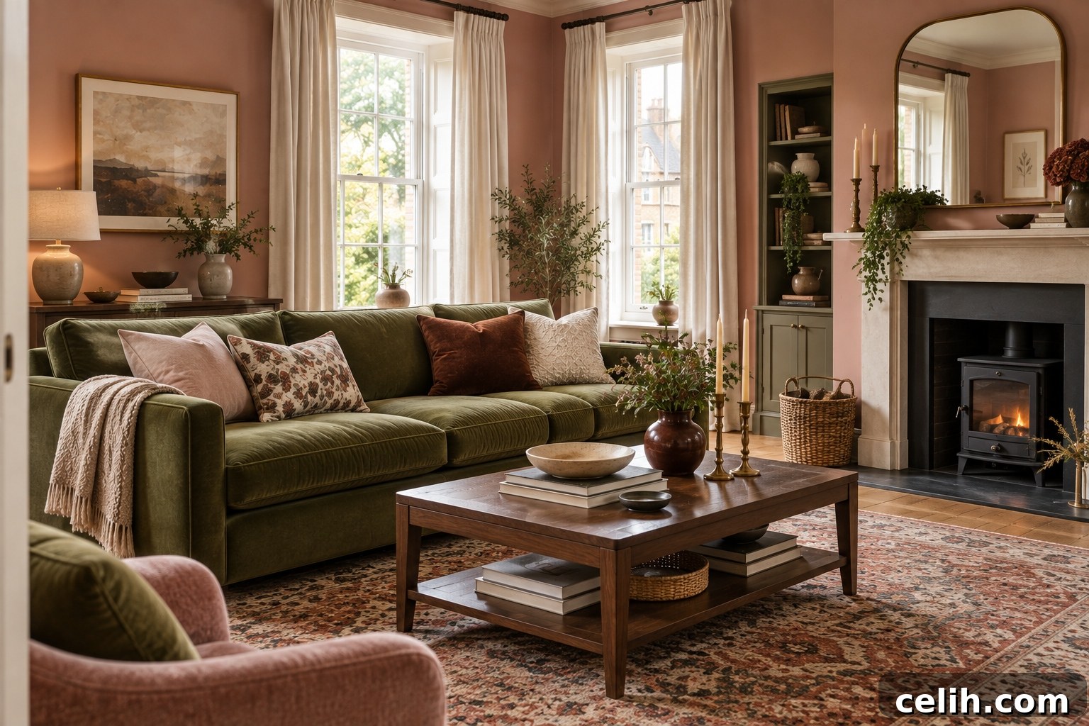
This is not sugary pink. The 2027 pinks are dustier and more grounded—think dusty rose, plaster pink, clay pink, muted salmon and terracotta pink. These shades blend pink with brown or clay undertones so they read as warm, subtle and versatile rather than overtly feminine.
Earthy pink operates like a neutral: it brings warmth and softness while remaining composed. It shifts with light, revealing rosier notes in bright daylight and warmer taupe or terracotta hints in dimmer conditions, which is precisely why it feels contemporary and layered.
Where it works: bedrooms and living rooms for a cocooning feel, but also kitchens, hallways and bathrooms. Pair with olive green, burgundy, cream, walnut, chocolate brown, ochre or softened blue. Dark timber keeps pink grounded and prevents it from feeling delicate.
Pink Is Becoming a Neutral
Because of its muted undertones, earthy pink can fulfill the same role as beige or taupe. It provides colour without demanding attention, making it an excellent choice when you want warmth and personality without drama.
2. Olive Green
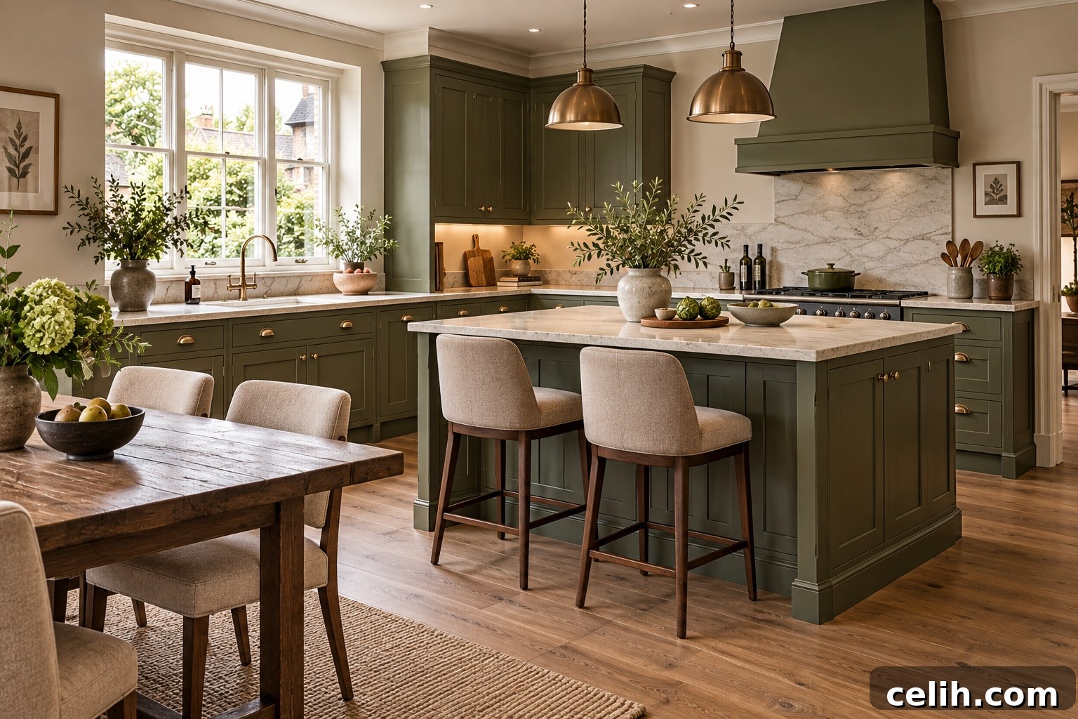
Green remains important but its preferred tones are evolving from pale sage toward deeper moss, olive and brown-greens. These richer, muddier greens feel warm and natural and can act almost like neutrals because of their yellow and brown undertones.
Why olive works: it doesn’t demand attention, sits beautifully with timber, stone and natural textiles, and can be used across a whole room without feeling overwhelming. Olive kitchens, studies and snug rooms can feel both colourful and restrained.
Pairs well with: earthy pink, burgundy, cream, terracotta and muted blue for a balanced look.
3. Softened Blue
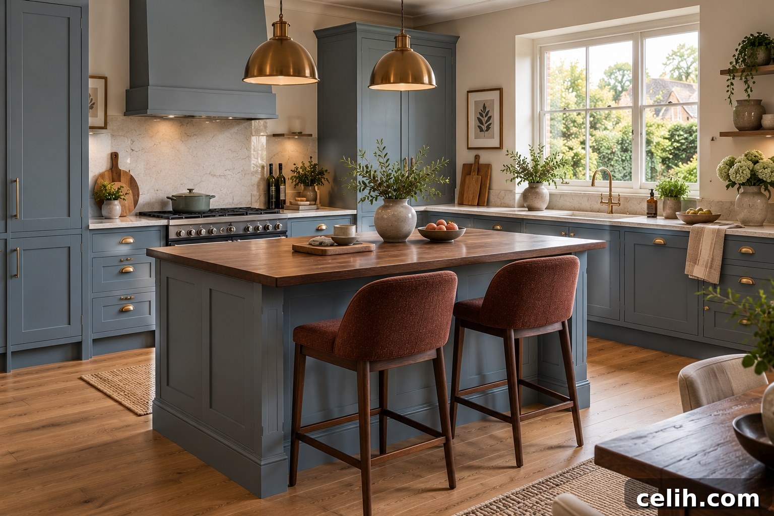
Blue remains a staple, but the character shifts from crisp blue-greys and saturated navy to weathered, chalky, faded denim and mineral blues. These greyer, warmer blues feel familiar and calm rather than crisp or coastal.
Softened blue provides contrast in a warm palette without feeling unrelated. Use it on walls, cabinetry or textiles alongside burgundy, olive, earthy pink, cream and walnut to create subtle, layered schemes.
4. Burgundy and Red-Brown
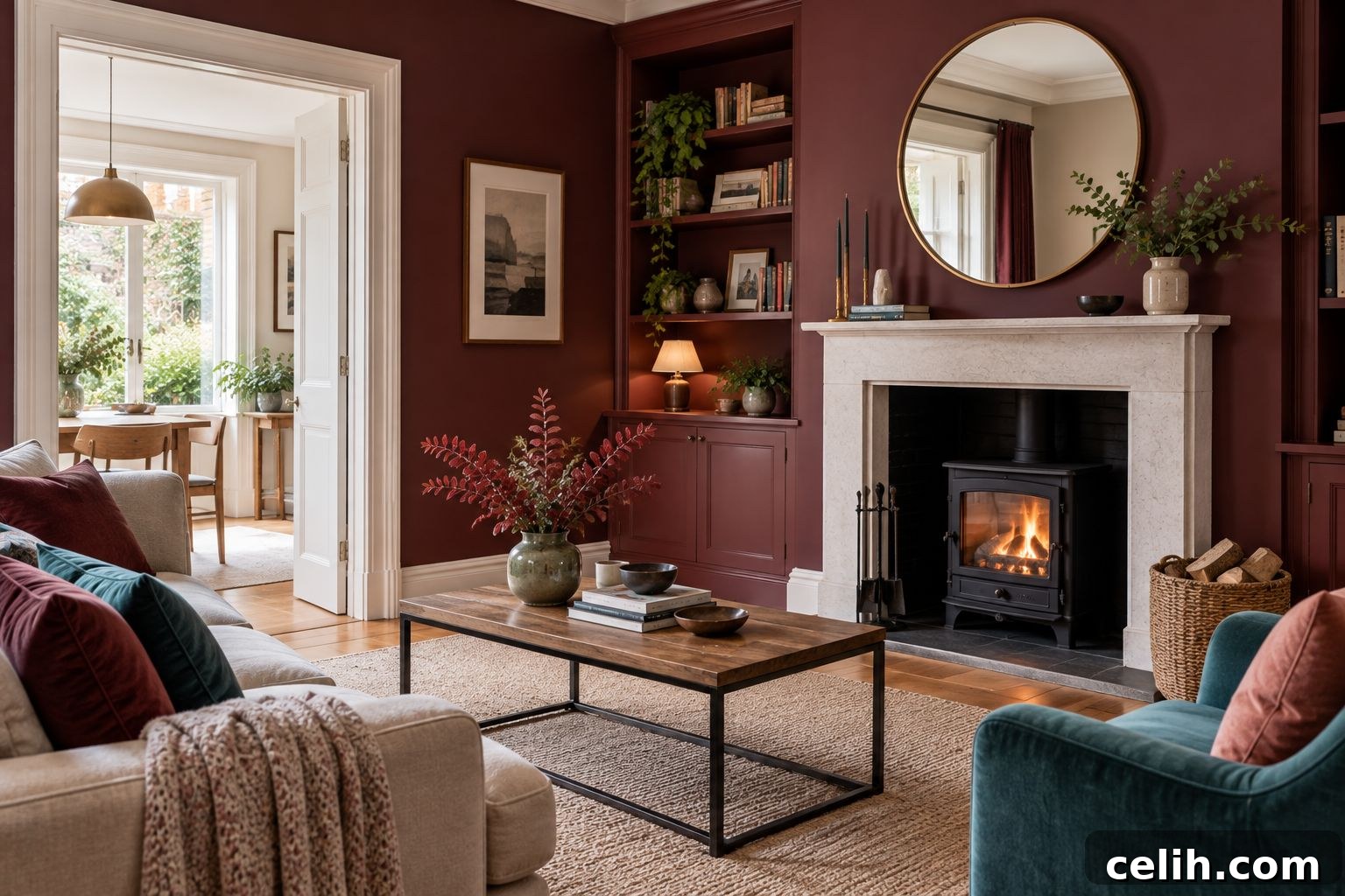
Dark red is shifting toward earthier tones: burgundy, oxblood, brick, mahogany, cordovan and brown-red. Adding brown undertones softens red’s intensity, making these hues deeply rich, grounded and easy to pair with timber and warm neutrals.
How to use: introduce burgundy via upholstery, cabinetry or curtains, or embrace it fully in smaller rooms like dining rooms or snugs where deep colour creates depth and intimacy. Great combinations include burgundy with dusty blue, olive, earthy pink or warm cream.
5. Warm Neutrals
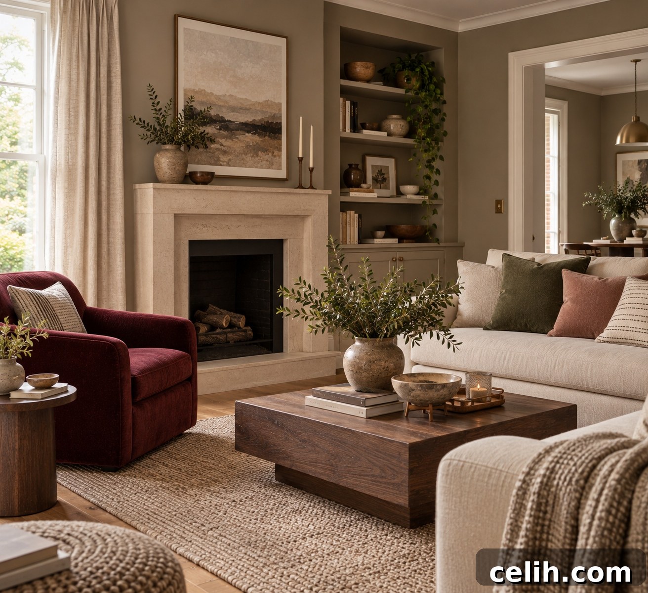
Neutrals aren’t vanishing; they are warming up. Look for mushroom, oatmeal, warm stone, putty, taupe, camel, sand, cream and clay-beige. Rather than carrying a whole room alone, these neutrals now act as foundations for richer earthy shades.
Use warm neutrals where light can make cooler shades feel flat—north-facing rooms, for example. They pair effortlessly with burgundy, olive, dusty blue and earthy pink, and help create calm, layered interiors.
The 2027 Colour Palette: Why These Shades Work Together
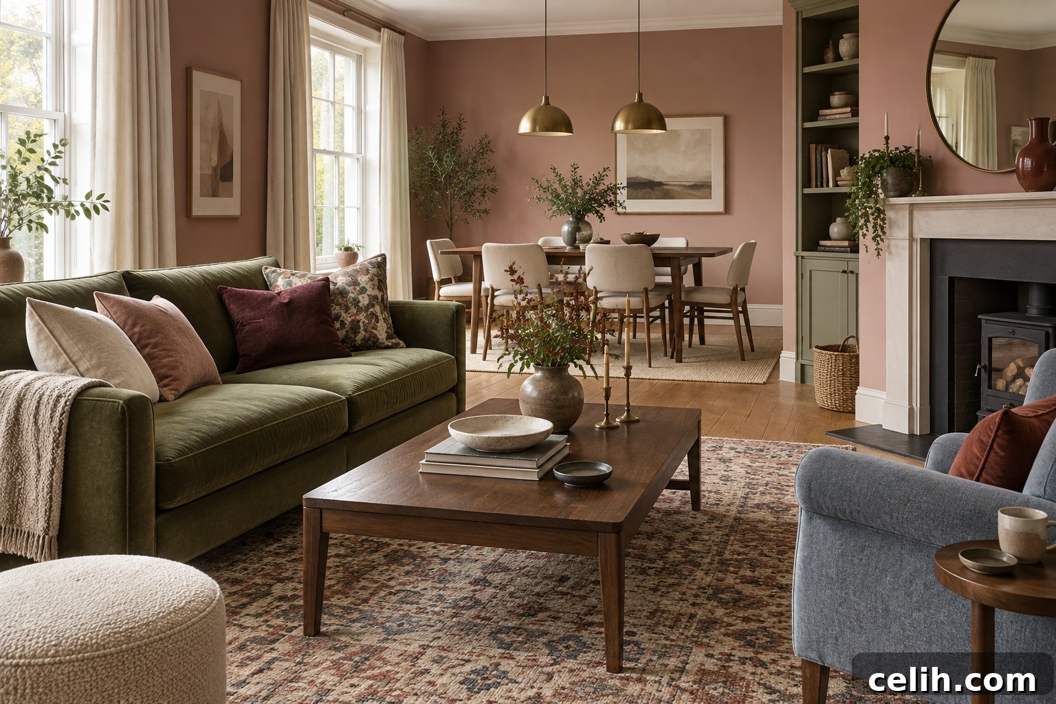
The most notable aspect of the 2027 forecasts is how well the colours layer. A practical palette might read: earthy pink, olive, softened blue, burgundy, mushroom and warm cream. What unites them are muted, mineral and earthy undertones that allow seemingly varied hues to coexist calmly.
Three schemes to try:
Soft and Natural
Earthy pink + olive + warm cream. Ideal for bedrooms or living rooms—pink walls, an olive chair and cream curtains with oak or walnut accents.
Rich and Sophisticated
Burgundy + mushroom + softened blue. Use mushroom as a quiet backdrop, burgundy on a large piece of furniture and blue in textiles or painted woodwork.
Modern Earthy
Olive + red-brown + clay + cream. Works beautifully with timber, terracotta, stone, linen and wool.
How to Use 2027 Colour Trends Without Redecorating Your Whole Home
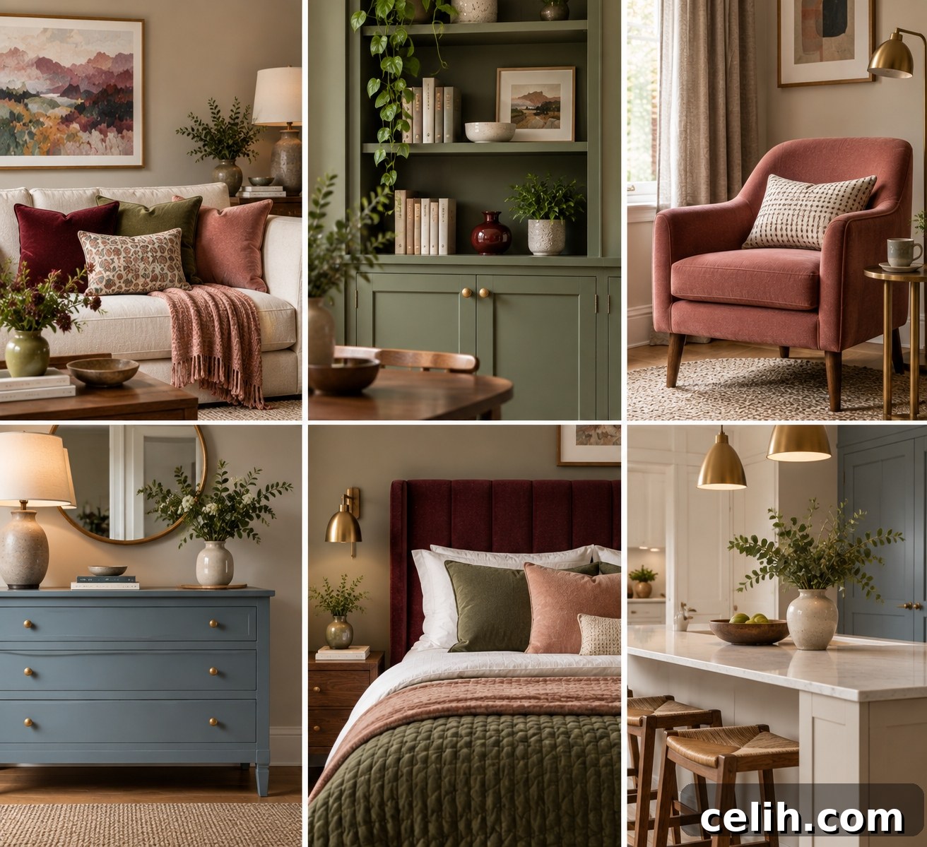
Treat trends as inspiration. Start small with cushions, rugs, artwork or an occasional chair. For a bigger change, paint cabinetry, an alcove or a single wall. Many 2027 shades—olive, warm blue and clay pink—are forgiving and won’t immediately date a space, which matters when investing in larger elements like kitchens or upholstery.
Which 2027 Colours Have the Most Staying Power?
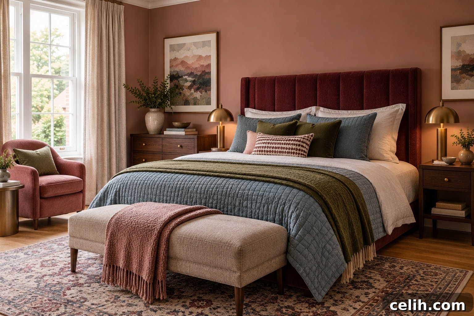
While no forecast is certain, some tones feel durable. Olive green and softened blue have natural associations and versatility that promise longevity. Warm neutrals will continue to shift subtly, and burgundy/red-brown have historical precedent that keeps them relevant. Earthy pink, once mixed with clay or taupe undertones, behaves more like a neutral and is more likely to endure than brighter pastels.
What Is the Biggest Colour Trend for 2027?
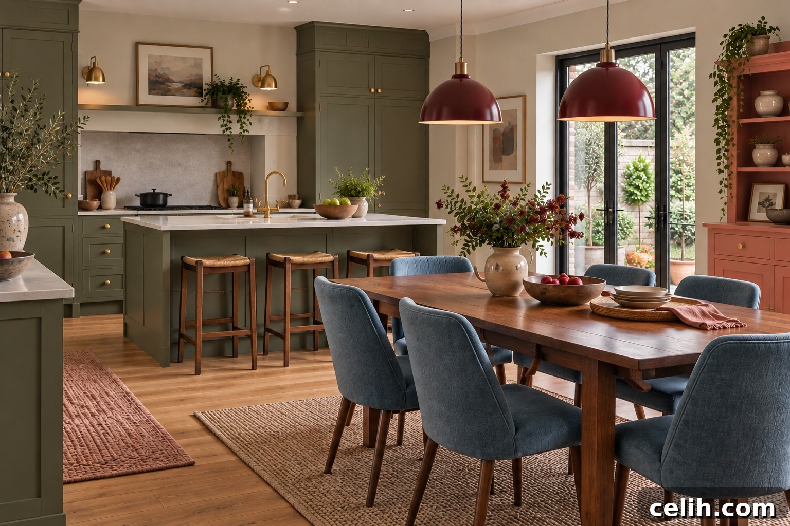
If there is one overarching trend, it is earthiness. Colours are becoming softer, muddier and mineral-driven. That shift allows homes to feel colourful without feeling loud: muted olive can function like a background, dusty blue can replace grey, and earthy pink can take the place of beige. The overall effect is warmer, richer and more personal.
2027 Is About Colour You Can Live With
The most appealing aspect of the 2027 direction is practicality. These colours bring personality while remaining comfortable and lasting. They favour layered, muted, mineral tones that adapt to light and materials—producing interiors that feel individual and inviting without shouting for attention.