
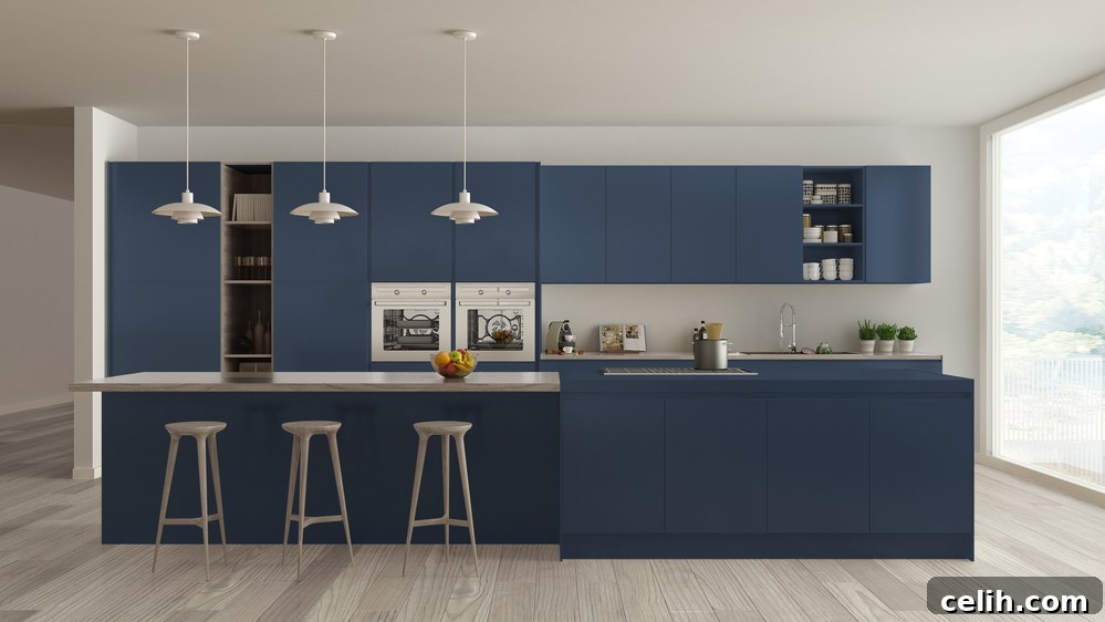
The kitchen, often hailed as the true heart of any home, transcends its primary function as merely a space for meal preparation. It’s a vibrant hub where families gather, stories are shared, and cherished memories are forged over countless cups of tea and celebratory dinners. Given its pivotal role and typically expansive nature, embarking on a color scheme revamp for such a vital area can feel like a daunting yet immensely rewarding undertaking. Every element within your kitchen—from the sleekness of your appliances and the style of your fixtures to the texture of your countertops and even a beloved matching kettle and toaster set—plays a crucial part in defining its aesthetic. When contemplating a fresh hue for your kitchen, envision how the chosen wall color can masterfully intertwine these diverse components, culminating in a cohesive, harmonious, and truly inviting environment that you’ll be delighted to inhabit and enjoy every single day.
Decoding Your Current Kitchen Palette: A Foundation for Change
Before dipping your paintbrush into a new color, it’s paramount to take stock of the existing colors that already define your kitchen space. Fixed elements such as cabinets, flooring, backsplash tiles, and major appliances contribute significantly to the area’s intrinsic color scheme. Thoughtfully factor in these present shades as you progress through your design decisions. For instance, if your kitchen is equipped with bold black appliances or features darker countertops, you might lean towards more vibrant, lighter, or warm-toned wall colors to introduce a sense of balance and prevent the space from feeling overly heavy or confined. Conversely, a kitchen with light cabinets and surfaces could benefit from deeper, richer wall colors to add depth and sophistication. An often-overlooked but critical step is to scrutinize the undertones of your countertops, cabinets, and flooring. These subtle underlying hues—whether they lean cool (blues, greens, grays), warm (reds, yellows, oranges), or neutral (beiges, taupes)—will dictate which new paint colors will best complement them, creating a truly harmonious and aesthetically pleasing environment.
Understanding the fundamental distinction between warm, cool, and neutral tones is incredibly helpful when curating a cohesive and harmonious palette for your kitchen. There isn’t a single definitive right or wrong approach to this process; personal preference plays a significant role. However, it’s crucial to remember that your kitchen design exists within a broader context. The last thing any homeowner desires is to regret a new kitchen paint color because it clashes discordantly with another permanent or semi-permanent element already present in the room. A well-considered palette ensures every component feels intentionally placed, contributing to a unified and inviting atmosphere.
Understanding Color Psychology: Setting the Kitchen Mood
Beyond mere aesthetics, the colors you choose for your kitchen can profoundly impact the mood and energy of the space. Color psychology suggests that different hues evoke specific emotional responses, which is particularly relevant in a high-traffic area like the kitchen. For example, warm colors like reds, oranges, and yellows are often associated with energy, warmth, and appetite stimulation, making them popular choices for spaces where food is enjoyed. However, too much intensity can feel overwhelming in a large area. Cooler tones such as blues and greens tend to promote feelings of calm, freshness, and cleanliness, ideal for creating a serene cooking environment. Neutrals—whites, grays, and beiges—offer versatility, timelessness, and a sense of sophistication, serving as excellent backdrops that allow other elements to shine. Consider the overall feeling you wish to cultivate in your kitchen. Do you envision a lively, bustling family hub, a tranquil culinary retreat, or a chic, minimalist gathering space? Aligning your color choices with these desired emotional effects will ensure your kitchen not only looks beautiful but also feels perfectly attuned to its purpose and your lifestyle.
Selecting the Perfect Finish for Enduring Beauty and Functionality
Once you’ve confidently narrowed down your paint color choices, the next critical decision involves selecting the appropriate type of finish you’ll be using. Traditional wisdom has long favored satin (often referred to as eggshell) finishes for kitchen walls due to their commendable scrub-resistant properties and their ability to subtly mask minor surface imperfections. It was widely believed that high-gloss and semi-gloss finishes were more suitably reserved for trim, where their reflective qualities could effectively highlight the intricate contours of molding, door panels, and window frames, adding a touch of architectural elegance.
However, contemporary paint technology and design trends have revolutionized how finishes are utilized. Modern designers are increasingly leveraging different sheens to create captivating visual interest and depth across entire walls, moving beyond their traditional roles. By strategically applying, for instance, a flat or satin finish on one wall and an adjacent wall in a semi-gloss of the very same shade, you can achieve a unique textural effect. When light playfully strikes these walls, it can evoke the soft, ribbed appearance of corduroy or the rich, velvety shimmer of velvet, adding an unexpected layer of sophistication and bespoke character to your kitchen. Beyond aesthetics, the kitchen’s high-traffic and moisture-prone nature means durability is key. Semi-gloss and gloss finishes offer superior resistance to moisture, grease, and stains, making them easier to clean and maintain, ensuring your kitchen walls remain fresh and vibrant for years to come.
Harmonizing New Paint with Existing Decor: A Cohesive Approach
Ensuring that your newly chosen kitchen paint color seamlessly blends with your existing decor is paramount for creating a truly unified and appealing space. If you’re currently planning more significant renovations, such as the installation of brand-new appliances, cabinetry, or even flooring, it would be highly prudent to defer your final paint color selection until these major updates are fully completed. This strategic delay is vital because accurately predicting the room’s ultimate aesthetic and feel before these significant changes are in place can be exceptionally challenging, often leading to misjudgments.
For kitchens that are already established and fully set up, your primary objective becomes identifying a paint color that perfectly complements your current decor. A practical first step is to visit a local hardware or paint store and gather an array of paint swatches that catch your eye. Once back in the familiar environment of your home, take the time to meticulously compare these samples against your kitchen cabinets, countertops, and appliances under various lighting conditions. This direct comparison will allow you to discern which color truly resonates and best suits your existing elements. For additional insights and professional services that can revitalize your space, including expert cabinet painting, you might consider exploring options available at local specialists, such as paysonspainting.ca for more information on transforming your kitchen with their expertise.
The Interplay of Light: How Illumination Transforms Color
As you meticulously refine your choice of kitchen paint color, it is absolutely crucial to deeply consider the specific lighting conditions prevalent in your kitchen throughout the various times of the day and night. Illumination—both natural and artificial—possesses an extraordinary ability to significantly influence how a paint color is perceived within your unique space. A shade that appears utterly wonderful and captivating in the controlled environment of a paint shop or elegantly displayed on a website might, astonishingly, look entirely different and perhaps even disappointing once applied to your kitchen walls.
Dedicate ample time to observing both the natural light that streams into your kitchen from windows and the quality of your artificial lighting, including the specific kind of bulbs you employ. North-facing rooms often receive cooler, dimmer light, making colors appear more muted. South-facing rooms are bathed in warm, bright light, intensifying colors. East-facing rooms experience bright morning light and cooler afternoon light, while west-facing rooms get warm afternoon light. Furthermore, the color temperature of your light bulbs—whether warm white (yellowish), cool white (bluish), or daylight (neutral)—will subtly alter how your chosen paint color registers. To ensure you ultimately land on the absolutely perfect color, it is imperative to experience and assess how it truly appears in your kitchen under these specific and fluctuating lighting conditions. Purchase a few sample pots and paint large swatches directly onto your walls, living with them for several days to observe their transformation from dawn to dusk.
Beyond Walls: Exploring Other Avenues for Color Expression
While wall colors are often the primary focus, the kitchen offers numerous other surfaces where color can be strategically introduced to enhance the overall design. Consider your cabinetry; repainting or refinishing cabinets can dramatically alter the look and feel of your kitchen without the expense of a full renovation. Choosing a contrasting color for your island cabinetry, for instance, can create a captivating focal point. Your backsplash is another excellent opportunity for color and texture. From classic subway tiles in a fresh hue to intricate patterns and bold, vibrant colors, the backsplash can serve as an artistic statement that ties the entire room together. Even smaller details like bar stools, window treatments, or decorative accessories can introduce pops of color that complement your main scheme. Don’t overlook the ceiling; painting it a slightly lighter shade of your wall color or even a soft, unexpected hue can make the room feel more expansive and thoughtfully designed. Each of these elements, when considered alongside your wall color, contributes to a rich, layered, and personalized kitchen aesthetic.
Embracing Trends vs. Timeless Choices: Designing for Longevity
When selecting a kitchen color scheme, many homeowners grapple with the dilemma of embracing current design trends versus opting for more timeless and classic choices. While it’s tempting to incorporate the latest popular colors, it’s wise to consider the longevity of your decision. Trendy colors, though fashionable now, might feel dated in a few years, potentially leading to earlier renovation fatigue. Timeless colors like shades of white, cream, soft gray, and certain blues tend to have enduring appeal and can withstand the ebb and flow of design fads. These classic hues also offer incredible versatility, acting as a neutral canvas that allows you to easily update your kitchen’s look with changeable elements like accessories, lighting fixtures, or textiles. If you adore a current trend, consider incorporating it through elements that are easier and less costly to change, such as a backsplash, specific accent cabinets, or decorative items, rather than committing to it on all major surfaces. Striking a balance between what you love today and what will bring you joy for years to come is key to a truly satisfying kitchen design.
Practical Tips for a Flawless Paint Application
Once you’ve made your final color and finish decisions, proper preparation and application are crucial for achieving professional-looking results. Begin by thoroughly cleaning your kitchen walls to remove any grease or grime, then repair any imperfections, such as nail holes or cracks. Sanding lightly and priming are essential steps, especially if you’re painting over a darker color or using a drastically different sheen. Invest in high-quality painter’s tape to protect trim and adjacent surfaces, ensuring crisp, clean lines. When applying the paint, use good quality brushes for cutting in around edges and a roller for larger areas, maintaining consistent pressure and overlapping strokes slightly to avoid streaks. Always allow adequate drying time between coats as recommended by the manufacturer, and remember that two thin coats are almost always better than one thick one for durability and a smooth finish. These practical steps, though seemingly minor, contribute significantly to the overall success and longevity of your kitchen’s new color scheme.
Crafting Your Dream Kitchen: A Concluding Perspective
The kitchen holds an undeniably significant importance within the fabric of any home, and its chosen color scheme possesses the profound power to either dramatically enhance or unfortunately diminish its overall appeal and functionality. By diligently utilizing this comprehensive guide—which walks you through understanding existing elements, recognizing subtle undertones, selecting appropriate finishes, harmonizing with decor, and thoughtfully considering the pivotal role of lighting—you are well-equipped to pick the perfect color that transcends mere aesthetics. This meticulous approach can truly transform your kitchen into more than just a room; it becomes a cherished space where you genuinely delight in the art of meal preparation, create and cherish invaluable time with family and friends, and consistently revel in an environment that is distinctly personalized, warmly inviting, and reflective of your unique style and comfort. Embrace the journey of color, and unlock the full potential of your kitchen as the vibrant heart of your home.